Showing posts with label stenciling. Show all posts

Tuesday, April 14, 2015

Blue Twig Studio - March Product Review and Projects

Deco-Art Media - black gesso, transparent crackle
glaze, white crackle paste, and white modeling paste
I had fun with the products from Blue Twig Studio for March. As a design team member, I review various products and create a project(s) with them.  The products I'm reviewing this month are:

  • Andy Skinner mixed media stencils - 
    • 6"x6" "Have Your Say" alphabet stencil 
    • Andy Skinner Stencils - 6'x6" alphabet and 12"x3" tread
    • 12" x 3" Tread Carefully 
  •  Deco Art Media
    • Black Gesso
    • Transparent Crackle Glaze
    • White Crackle Paste
    • White Modeling Paste
  • My own products added to create projects
    • Matte medium
    • Acrylic paint
    • Dylusions Ink Sprays:
    • Paper ephemera (magazines, music)
    • Tim Holtz Distress Paints
    • Luninarte Silks Acrylic Glazes
    • Palette knife
    • Stencil brush

Projects:  I created two pieces of art using these products. I started both on 8" x 10" canvas boards.

Collage Project:  

 I layered various pictures from magazines, music, and words in a
pleasing arrangement and glued them down using matte medium. 
 
 Next, I spritzed the board with yellows, pinks and purple Dylusion Ink sprays.
I spread the white modeling paste through the tread stencil 
with a palette knife to various areas of the collage.
I painted the dried white modeling paste with blue, maroon, and gold Luminarte Silk Acrylic Glazes.  I chose the Silk glazes, as they have a sparkle to them when dry. I added a light purple acrylic paint to the white crackle paste and spread that with the palette knife through the alphabet stencil.
Finally, after the paint and crackle paste had dried, I added the transparent crackle glaze over the eye, flowers in the vase, and cheetah heads. Unfortunately, in the photo, the crackle effect from both the purple crackle paste and the transparent crackle glaze do not show up. However, the transparent crackle glaze adds a wonderful sparkle to the collage.


Stenciled ZIA Project:
Initially, I covered the canvas board with the black gesso and let it dry. Next I spritzed copper, gold, blue, and lime green Dylusion Ink sprays using papers to mark off broad lines to spray.
Next, I painted various metallic acrylic paints and a few Tim Holtz distress stains in blue, copper, pink and purple through the Tread Carefully stencil with a stencil brush diagonally across the stripes. I painted a 2nd Tread Carefully diagonal in light blue, fern green, and pinks in the opposite direction.  
Next, I spread the white modeling paste with a palette knife through various 6" x 6" stencils that reminded me of Zentangle tangle patterns. Note: the lime green Dylusions ink bled through the white modeling paste even though it had cured for 24 hours.
Finally, I painted the modeling paste with white acrylic paint where the lime green Dylusion ink had bled through.  Unfortunately, in the photo, the Dylusion ink stripes do not show up very well through the modeling paste like they actually appear. I decided this project was complete, as it reminded me of a Zentangle, but done with stencils, paint, and modeling paste!

Product Review:  
       I enjoyed working with this month's products. The stencils are fun and will be used frequently. I can see the Tread Carefully, not only as a tread, but as animal skin, dragon skin, stones, landscape, and so on. The Alphabet stencil will come in handy for many mixed-media projects.
       Black gesso will be wonderful for making colors pop or to just do something different than using white gesso for a base. 
       The modeling paste spreads very easily with a palette knife through the stencils - even in small openings. It dries semi-transparent, as I could read some of the letters and music after it had dried in the collage project. However, I did find that the lime green Dylusions ink bled completely through the modeling paste in the ZIA project. A bit of the yellow Dylusion ink bled through the modeling paste in the collage paste, but not as dramatically as the lime green bled. None of the other Dylusions ink colors bled at all.
       The white crackle paste worked wonderfully. It mixed easily with paint, so color can be added to the paste. It spread easily with the palette knife through the stencil. Although, once I added paint, it bled a bit under some of the thinner lines in the stencil. I was able to remove the paste with a small paintbrush or toothpick where it had bled under the stencil in many cases.
       The transparent crackle glaze adds a nice sparkle. It is self-leveling, so it does not work under stencils. I tried it with the Tread Carefully stencil and it spread terribly, so I scraped it off with the palette knife before it dried. Therefore, only use the transparent crackle glaze on open areas. Also, I used a toothpick to pop any bubbles. One comment: it was hard to see if I had the areas I wanted covered coated evenly. I wasn't able to tell until it had dried. I did not try to add another layer in thinner areas. 


Thank you for joining me this month. The projects can be seen at Blue Twig Studio in Colorado Springs, Colorado. I hope you will consider trying some of these products. 

Keep creating.
Lynnita


Monday, April 13, 2015

March ATC Challenge - Fairy Tales

It's been a couple hectic weeks. I'm running behind in posting again! Someday, I'm going to figure out how to help my daughter and son-in-law with their special needs daughter, taking her to several doctor's appointments, babysitting my other grandchildren, posting photos of all the grandchildren for our Ohio family on facebook, continue creating artwork and quilts, while finding time to post on my blog!! I'm not sure how young mothers do it all!!  I was doing fine until our special granddaughter was born prematurely. Since then, I've been struggling to post at all, let alone in a timely manner! Lol!!

Today, my goal is to get a few posts completed that I should have posted in the last couple of weeks. First is Blue Twig Studio's ATC Challenge for March, which was Fairy Tales.  I have loved fairy tales since I was a child. Two of my favorite books as a child were Grimm's Fairy Tales and a book of tall tales and fables that my parents gave me for Christmas when I was 8 years old. I still treasure those books. I've been a science fiction and fantasy reader ever since!

The first card I created was "Elfin Maiden". I used Dylusions Ink Spray through a flower stencil on watercolor paper. After it dried, I blocked in a face with white paint. I used Derwent watercolor pencils to create the face and outlined details with a 0.1 black Sakura Micron Pen. The face was created with inspiration from Jane Davenport's book: Drawing and Painting Beautiful Faces.

Elfin Maiden, 2 1/2" x 3 1/2", watercolor and inks on 140lb watercolor paper 
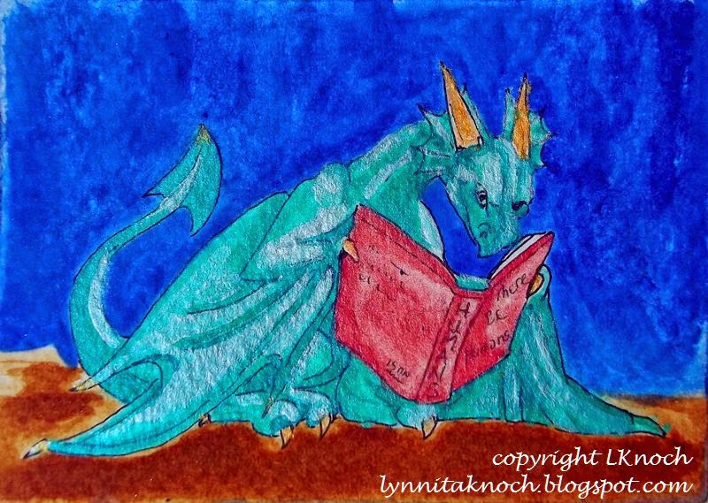
I love dragons and collect dragon figurines. The past year (if you've followed my blog), I worked through the exercises from a book on drawing dragons by J. "Neon Dragon" Peffer. This ATC card, The Reading Dragon, was inspired from one of her books. I painted the background with acrylics. After sketching in the dragon, I painted him with Derwent watercolor pencils and acrylics. I outlined with a 0.2 black Sakura micron pen.

The Reading Dragon, 3 1/2" x 2 1/2", acrylics and watercolor on Bristol paper.
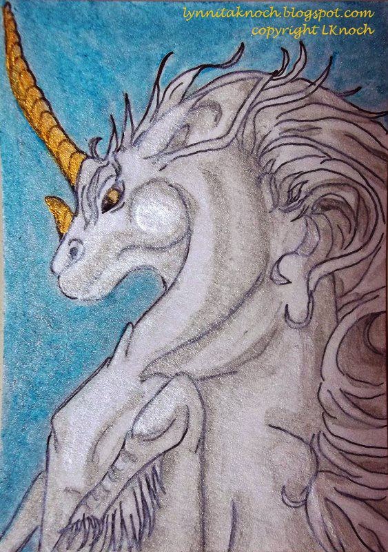
The final card is a prancing unicorn. My daughter told me I needed to make a unicorn, when I had been thinking about Red Riding Hood. The unicorn won out! With help from a book on fantasy creatures by J. "Neon Dragon" Peffer, Dragonart: How to Draw Fantastic Dragons and Fantasy Creatures, I created this proud unicorn.  I sketched in the unicorn and painted him with acrylics and Derwent watercolor pencils. I outlined him with a 0.2 black Sakura micron pen. I used watercolors to fill in the background.

Prancing Unicorn, 2 1/2" x 3 1/2", watercolor and Sakura pen on Bristol paper.
I enjoyed this month's ATC challenge! I hope you join the group next month! You only need to make one ATC card. They are only 2 1/2" x 3 1/2" in size, so it doesn't take a huge commitment to create this size artwork. It's fun, challenging, a great time to experiment. And you might win!!

Whatever you decide, have fun with your artwork and experiment!


Keep creating!
Lynnita


Thursday, March 12, 2015

Blue Twig Studio - Feb Product Review

I'm running a bit late with February's product review for Blue Twig Studio as my granddaughter was born a month premature and spent 3 weeks in the neonatal ICU, I had hand surgery on my dominant hand to remove a ganglion cyst, and then I needed IV fluids for severe dehydration due the worst case of flu I have ever had. It was a long month. Our granddaughter is now home from the hospital and doing well. She will require open heart surgery when she is 4-6 months old to repair a congenital heart defect. I am feeling much better and my hand has healed for the most part - at least I can use it again!

I finally finished my review and project for five different black pens and a sketchbook.

The pens include:

Various black pens on mixed-media paper.
  •  a black Sakura 02 micron pen (0.30mm nib) - an archival writing and design pen; acid-free; fine-line for papercrafts, journals, illustration, manga art and crafts; comes in 6 nib sizes and 15 colors.
  • a black Faber Castell Pitt artist pen (0.60mm nib) - black India ink; waterproof; permanent; acid-free; archival; for sketching, journals, cartooning, fine-ink drawings; perfect for mixed-media; ideal for traveling. 
  • a black Sakura 05 Microperm pen (0.45mm nib) - permanent on most surfaces; water and fade resistant; alcohol based cleaners may remove ink; do not launder; test prior to final application; low odor. 
  • a black Uni-ball Signo 207 Impact gel pen (1.0mm nib) - contoured rubber grip; uni-super InkTM to help prevent against check and document fraud; thick, vibrant lines to make a bold statement; refillable, quick-drying, fade- and water-resistant gel pen. 
  • a black fine point Sharpie pen.(1.00mm nib) - a permanent marker that marks on most surfaces; is quick-drying, fade-and water-resistant; no bleed and smear resistant.
Bleed-thru of pens on mixed-media paper.
The photo above shows the five pens written on mixed-media paper with a tangle pattern that used a heavy black fill. All the pens wrote well. The Sakura micron and the Faber-Castell Pitt artist pen both have a nice, fine black mark. This is nice for writing, illustrating and fine lines for Zentangles or ZIAs (Zentangle-Inspired Art). The Sakura Microperm pen is actually darker than the Uni-ball Signo Impact gel pen, although it has a smaller nib size. The Sharpie fine-point pen having the boldest, blackest line of all the pens. It has the same nib size as the Uni-ball Signo Impact 207 gel pen.

The Sakura Microperm pen and the Sharpie
fine-point pen both show significant bleed-thru on mixed-media paper.  The tangle patterns for both the Faber Castell Pitt artist pen and Uni-ball Signo Impact 207 gel pen can be seen in the photo on the reverse side of the paper, but the actual paper does not show bleed-thru.


Crescent RENDЯ 
3.5" x 5.5" sketchbook.   
The sketchbook:
I reviewed a Crescent RENDЯ 3.5" x 5.5" sketchbook. It has acid- and lignin-free, white heavy-weight, 110 lb paper consisting of 32 sheets or 64 pages, with a regular binding. The sketchbook claims media won't bleed though pages, that the pages will lay flat, and it can be used with all media, including spray paint, markers, pastels, pencil (or charcoal), watercolors, and ink. Note: Limited show-through may occur over time with heavy application of Xylene markers. This sketchbook is made in the USA.

I first created several pages in black and white, using the five pens included in the review. I am happy to report that not one of the black pens show any sign of bleed-thru. I was able to work on both sides of the pages for my art journaling. After creating the artwork with the various pens, I went back and added color using various media to test the claims of the sketchbook. None of the media I used bled-thru the pages, although some of the watercolors, spray paints, and pastels managed to run over the edges of the sheets onto other sheets, as I was very enthusiastic in my application of the various media. Following is the artwork I created in the sketchbook to date.

Title page using Sakura micron pen.
Title page after adding watercolors. I also added gel 
pens in various colors over the letters in "Journal". 
The page curled initially after getting wet from the 
watercolors, but eventually dried flat.

Quote using the Faber-Castell Pitt artist pen. Zingers and feather done with Sakura micron pen.
Added Tim Holtz Distress Stain in spiced marmalade through a TCW Mini
Daisy Cluster 6" stencil. Added red ink with a Sakura Moonlight gel pen. 
Zentangle Garden using Sakura micron, Faber-Castell Pitt artist, and
Sakura Microperm pens and shaded with charcoal.
Derwent watercolor pencils were used to add color to the Zentangle Garden.
Zentangle stripes using Sakura micron, Sakura Micropern, and Uni-ball Signo Impact pens.
Prismacolor Nupastel color blocks used to add a rainbow of color between
 the Zentangle stripes. Sealed with Krylon Workable Fixatif 1306.
Dragon and quote created with Sharpie fine-point and Sakura Microperm pens.
Tim Holtz Distress Stain in aged mahogany applied to TCW Mini Navaho 6" stencil over the quote. Background, horns, beak, and eyes of dragon painted with Derwent watercolor pencils. Dragon wings and scales painted with blackberry Facetten-Lack Croco Crackling Colour. Unfortunately, only a few spots on the body were thick enough to show the crackling effect. The rest was painted too thin for the paint to crackle.  
Griffin Momma and babies. Momma griffin created with Uni-ball
Signo Impact gel pen and babies created with Sakura micron pen.
Griffins painted with Prismacolor Premiere markers and Tombow markers. 
Tombow marker blender used to help blend the various shades of markers. 
Background painted with Derwent watercolor pencils.
Sisters created with Faber-Castell Pitt artist pen.
Background spray-painted in layers with Dylusions Ink Spray in London blue, lemon zest, and pure sunshine, and Perfect Pearls Mists in perfect copper.  TCW Mini Swirly Garden and TCW Mini Wedding Ring stencils were used.  The faces were painted with titanium white acrylic paint and various shades of Derwent watercolor pencils. The hair was created from a clothing catalog and adhered using matte medium.


I enjoyed all the products this month. A variety of black pens is essential for artwork, as drawings, Zentangles, illustrations, quotes, mixed-media, and so forth, all require a mixture of line widths and a shades of black. The Crescent RENDЯ sketchbook was a joy to work with using a variety of media. I felt it met the claims it made - I had no bleed-thru using any of the black pens or the various media I added to my artwork. The pages laid flat, so I could easily work across two pages.  Note:  I did not use gesso on any of these pages prior to creating any of the above drawings, as I did not want it to add any strength to the paper in order to test the claims made by the company.

The only comment I have would be to watch the amount of water (or alcohol) added to the page, as too much can make the pages start to roughen. Although, I scrubbed a few spots and still had no bleed-thru and could still paint these spots. Also, the more liquid added to the pages, the more they curl. However, the pages became almost flat once dry. If they need to be completely flat, the sketchbook can be pressed between two heavy items to finish flattening any curled pages.

I would definitely use a Crescent RENDЯ sketchbook for any art journal needs. The 3.5" x 5.5" size is perfect for traveling. It fits in my purse nicely, along with the pens, to enable me to create anywhere. A larger size would be nice for working out of at home.

Keep creating!
Lynnita


Monday, December 1, 2014

Blue Twig Studio - Dec Review of Products and Project Step-Outs

As part of Blue Twig Studio's Design Team, I will be reviewing products and doing at least one project each month. For the month of December, I am reviewing the November Fabric Club Kit.

Products  Reviewed and Used for Project:
Blue Twig Studio's November Fabric Club Kit. 

Included in the November Fabric Club Kit:
  1. Five fat quarters (18" x 22") of Tim Holtz's Eclectic Elements fabric line. 
    • Two are a snakeskin design, one in blacks and the other in brown shades. 
    • The third has various streets, such as 179 Times Square, P'kway Queens Plaza, Metropolitan Av, 8th Coney Island, Kings Highway in shades of browns and tans.
    • The fourth piece are logos of various hotels around the world in tans, grays, and browns. Examples are the Ritz Barcelona, Hotel Barker in Seattle Washington, Hotel Merkur in Nurnberg, Hotel Mount Everest in Darjeeling, India, Raffles Hotel in Singapore, and so forth., 
    • The last piece has various numbers and fractions, going in different directions in shades of tans and browns.
  2. Two 125 yard spools of Heavy Dual Duty XP Coats and Clark polyester thread in chocolate brown and black. 
  3. Three 1 1/2" four-hole wood buttons with mottled shading of tans, rusts, and browns. 
Other products that I used to create my project (a 8" x 10" wall hanging) include:

     
     *  Jacquard Textile Paint in 123 White. You could use gesso or any other paint brand. I used the Jacquard, as I had been using it for another project and already had it out and easily available.


     *  The shimmering gold acrylic ink from a Daler-Rowney FW Shimmering Colours Set of Acrylic Artists Ink.  (Could use another brand of shimmering or glittery paint.)

     *  Other fabrics including gold lame, silver lacy tulle, and brown tulle. These add texture and interest. (Any fabrics could be added.)


     *  Wine and yellow silk threads fibers(Any fibers could be use , i.e. Angelina fibers, fancy yarns, wool felt… Also could add hand-stitching to for texture and interest.)


      *  Timtex interfacing.  Timtex is 100% polyester for consistent thickness and texture. It's firm yet flexible. It's perfect for shaping into 3-D craft projects. It's easy to cut, mark and sew. Machine wash and dry. It can be bought in packages or by the yard. (Could use any interfacing, batting, a piece of flannel, or canvas.)


Project Step-Out:

I first cut a piece of Timtex interfacing to size (8" x 10"). Then I used the street name fabric to cover the back of the timtex. I folded the edges around to the front and stitched them down with the black Coats and Clark thread included in the kit. Next I added a label that I hand-wrote with a black 0.03 micron. Sakura pen and stitched that into the lower right-hand corner of the back of the wall hanging.

Back of 8" x 10" wall hanging with "Faces" label.
Now I was ready to create my wall hanging. I laid out pieces of all five fabrics in various sizes to create a collage and stitched these to the front. I didn't put the fabrics in any particular order. I added part of the selvage edges to show they were Tim Holtz's fabrics, and also, just for fun.

Step 1. Collage of all five fabrics stitched randomly to the front.
I fused a piece of the lacy silver tulle and three flame-shaped strips of gold lame to the collage. Then, I stenciled the three-quarter view face stencil using Jacquard textile white paint. I added the hair with more white paint and a brush.

Step 2. Add gold lame and silver tulle. Stencil face and paint hair.
 She needed some more color, so I chose the shimmering gold DR acrylic artists ink to add gold eye shadow and gold to her hair. It looks better in the collage, as you can see the gold shimmer, which the camera did not pick up well.
Step 3. Painted gold shimmering acrylic ink to the eyelids and hair.
I sewed on the buttons for a necklace. Then I added metallic beads in various sizes (6, 8, 11) on either side of a large raku face bead for a barrette in her hair. Finally, I laid out various strands of a variety of neutral colors of pearl cotton and couched them with three small Chinese coins and size 11 beads.

Step 4. Attach buttons, beads, pearl cotton and Chinese coins.
 Finally, I used an awl to punch 3 holes in the top, attaching a small 10" mesquite branch (about 1/2" in diameter) with gold ribbon for the hanger of the wall hanging.

Final mixed-media, collaged wall hanging, 8" x 10". 

Product Review:

I was thrilled to receive the November Fabric Club Kit, as I love Tim Holtz's Eclectic Element fabric line and haven't had a chance to buy any of his fabrics, as I could not find them at any local quilt stores in the Phoenix, AZ area. I think fabrics with words and numbers are such fun to create tote bags, messenger bags, and/or purses. But better yet, they work well for collage quilts, modern quilts, backgrounds for pictorial quilts, and/or mixed-media art work. I created an 8" x 10" mixed-media wall hanging with the kit. I have enough fabric left to make a small quilt or a small purse. I'll let you know what I create when I get to it. (With upcoming holidays, it will be a few months.)

I had a problem with the buttons that you need to be aware of. They can NOT be sewn on by machine, as the hole spacing is wider than the industry standard for buttons. I'm glad I always check the hole spacing before I just hit sew, or I would have broken a needle and possibly thrown off the machine's timing. A note with the buttons stating that they have a wider hole spacing than the industry standard for buttons would have been nice. So beware when buying buttons to check the hole spacing before just stitching on your sewing machine! 

The thread states "heavy", but I could not find the size (30wt, 40wt, 50wt?) on the spool anywhere. My 80/12 needle worked, but the 90/14 was better. To hand-sew the buttons, I had to use a larger hand-needle than I normally use for hand-stitching, as well. A size 9 worked well.  Again, it would be nice to have the size of thread put on the label, so you are not guessing what size needles (machine or hand) to use with it. (I did use both the brown and black threads for sewing the project.)


This wall hanging can be seen at Blue Twig Studio after Dec 3rd. I hope these step-outs give you some direction to take for your own  mixed-media, collaged wall-hanging.

Keep creating!
Lynnita


Friday, October 31, 2014

Blue Twig Studio Design Team: Review of Products and first Projects

I have been asked to be a member of Deb Prewitt's Design Team for her shop, Blue Twig Studio.  I feel very honored that Deb chose me. I pray I live up to her expectations! I appreciate any and all comments, as your input is valuable to me.

For the month of November, I tested a few products and used them in two projects (a postcard and tealight holders) that will be displayed at Blue Twig Studio.  I started with quick, easy projects, so these could be done for the upcoming holidays - a handmade postcard you could send someone special or tealight holders for gifts or to decorate your home.

The products I'm specifically testing and reviewing this month are:
  1. Tim Holtz's Distress Paint in brushed pewter  and victorian velvet (pink). (photos 1, 2). These are acrylic paints dabbers for multiple surfaces.
  2. Viva Croco Crackling Color in blackberry (purple color) (photo 3) 
  3. a Mini Navaho, 6x6 Stencil by The Crafters Workshop.com, Designs by Jaime (photo 4)
Photo 1.  Tim Holtz's Distress Paint. 
Photo 2.  Sponge dabbers to
apply the acrylic paint.
Photo 3. Viva Croco Crackling Colour


Photo 4. Mini Navaho 6x6 stencil by The Crafter's Workshop, Designs by Jaime
  A couple other products I used to help create the projects were:
  1. Dylusions Ink Spray in bubblegum pink (photo 5)
  2. Martha Stewart Crafts: Fine Glitter Translucent Glass Paint in antique silver (gold color) (photo 5).
Photo 5. Dylusions Ink Spray and Martha Stewart Crafts: Fine Glitter Translucent Glass Paint.


First Project: Postcard
Photo 6. Postcard with pewter paint.
   The postcard is Strathmore 140 lb 4" x 6" acid-free, cold-pressed watercolor paper. I coated the postcard with the brushed pewter distress paint, leaving a shiny gray surface (photo 6). I added the victorian velvet (pink) paint through the stencil (photo 7), but it didn't work very well. The paint bled under the stencil, leaving a fuzzy pattern. I ended up smearing the paint over the entire postcard, so the postcard has a mottled background of pewter and pink.(photo 8). I decided to try the glittery translucent paint that I have in antique silver with the stencil (photo 9.) Some of the stencil pattern isn't well-defined, but I like the texture and color it adds to the matte effect of the distress paints. I like bright colors, so I sprayed Dylusions Ink Spray in bubblegum pink through the stencil over one corner of the postcard. (photo 10). To see how the cracking colour works on paper,  I added it to just a few of the stenciled areas for more interest, texture, and value (photo 11).  After the crackling colour dried for 24 hours, I zentangled the word JOY using black Sakura micron pens in sizes 0.01, 0.03, and 0.05 (photo 12). For further embellishment, I added a large opalescent sequin and a pink fabric flower over it the "O" (photo 13).

Photo 7. Adding pink paint through the stencil.
Photo 8. Mottled background layer of pewter and pink paint.


Photo 10. Sprayed Dylusions Ink Spray through stencil.
Photo 9. Glittery translucent paint stenciled.


Photo 12. "JOY" zentangled with micron pens across postcard

Photo 11. Crackling colour added selectively.
Photo 13. Finished postcard front. 

    The back of the postcard looked naked being bare of any paint or designs. I painted the back of the postcard with the distress paint dabbers, again creating a mottled pewter and victorian velvet (pink) background.   I added these quotes about JOY to the back once the paint was dry.(photo 14).

  • "Choose JOY" - Sara Frankl
  • "JOY, being happy, is a choice that you make every day." - Dawn Camp
  • "I will take Joy in the God of my salvation." - Habakkuk 3:18

I addressed it to myself for Deb to mail to me when she is done with the sample.

Photo 14. Back of postcard showing the "letter" side.


Second Project: Tealight Holders
     I also made tealight holders with the crackling colour. I started with a pair of 2" square glass holders (photo 15). Initially I painted them with the Martha Stewart Translucent Glittery Glass Paint in antique silver, which actually was more gold in color (photo 16). After that dried, I painted them with the blackberry crackling colour (photo 17). It needed to cure for 24 hours (photo 18), although the crackling started to appear after only a couple of hours. The tealight holders would look fine this way, but I decided to embellish them with a ribbon, a couple of leaf-shaped sequins, and a circular gold crystal, which I hot-glued to the tealight holders. They look beautiful with the tealights glowing through the crackling colour (photo 19).

Photo 15: Two-inch glass tealight holders.
Photo 16. Coated with antique silver glittery glass paint.
Photo 18. After curing crackling colour for 24 hours.

Photo 17. Adding the blackberry crackling colour.

Photo 19. Golden glow of tealights through the crackling. Holders embellished with ribbon, sequins and crystal.

These tealight holders will make nice, inexpensive gifts for the upcoming holidays or can be used to decorate your home. I love the soft, golden glow showing the crackling effect.


Notes about the products:
    Tim Holtz's sponge dabbers were easy to use the first time I opened them. The paint rolled smoothly over the surface of a watercolor paper postcard.  However, there were a couple days between using the Tim Holtz's Distress Paint dabbers on the front of the postcard and the back of the postcard. I had no problems with the victorian velvet color, but the brushed pewter dabber would not allow paint to flow onto the dabber sponge. I found the ball for mixing the metallic paint was stuck in the opening where the paint flows. However, even after removing it, I still could not get paint to flow onto the dabber sponge. I ended up using removing the dabber sponge cap and dipping a paint brush into the bottle of paint and knocking it over in the process. Thankfully, I was able to save most of the paint. The bottles do say to store them upside-down, which I did. I would advise if the dabber will not work, to pour a couple drops of paint into a palette and close the bottle.  (Do NOT work with an open bottle of paint! lol!)
    The directions for the crackling colour say to use a thicker layer to get the best crackling effect, with 1-4 mm being the optimum range of thickness.  The crackling on the postcard and the glass tealight holders came out best where I layered the colour closer to 1mm than the 4mm of thickness. The thicker layers on the glass did not crackle as well (as can be seen in photo 19). On the other hand, too thin a layer does not crackle at all  - this happened on one place on the postcard, where I got the layer too thin (photo 13).

Other thoughts:
     I had never used the Viva Croco Crackling Colour before, although I have used Tim Holtz's Distress Paint previously. The victorian velvet and brushing pewter created a challenge, as these are not colors I normally use. But I had fun creating the postcard. I plan to create more postcards to send to family for the upcoming holidays. I love the tealight holders, but  I enjoy lighting candles especially when we have guests. I will be making more sets of these to give to my daughter and daughters-in-law for Christmas.

     I hope you enjoyed the review and projects. Try these products, if you haven't already. Experiment and have fun!


Keep creating!!