Showing posts with label painting. Show all posts

Friday, June 26, 2015

Week 21 - Weekly Art Challenge - Other Artwork

For Week 21, I didn't get anything new completed to post. So I'm posting a couple pieces that I finished some time ago. 

Dad's Hunting Dog - 20" x 16", oil on canvas
 This is an oil painting I did for my father-in-law of one of his favorite hunting dogs that he lost too early. He was very pleased and it hangs in the dining room of his home.

Mom and Dad - 20" x 16", oil on canvas
I painted this portrait of my parents from a photo I took of them when they stayed with me in Florida one year while I had surgery. My parents had fun figuring out when I photographed them in the clothing they are wearing, as they couldn't remember having any such outfits! I had to laugh and tell them it's artistic license! (Mom is an artist, so she should have guessed this!). Dad had a white T-shirt with a wild print on, so I painted it as yellow. Mom wore a bright, printed button-down shirt. I painted a plain blue jacket over her brightly-colored top. They were very surprised with the gift and it has a prominent location in their home, overlooking photos of the rest of the family.

I no longer work in oils very much, as the smell bothers me more and I'm starting to react to the oils if I get them on my hands for any length of time. It's a shame, as they are easy to work with and so forgiving if a mistake is made!  However, water-soluble oils are now available. I don't know if I would react the same to these, since I wouldn't have to work with solvents. I might have to give them a try.


Keep creating!
Lynnita


Wednesday, June 24, 2015

Week 19 - Weekly Art Challenge - Patt Blair Retreat

I'll be trying to post the last few weeks art challenges in the next few days. I'm running behind due to computer issues and life (especially babysitting three grandchildren that range from infant to toddlers!)

For the last three years, I've been attending a quilt retreat in May with Patt Blair at Vina de Lestonnac in Temecula, CA. It's an awesome time, with many of the same people returning each year. So it's more like catching up with old friends who all enjoy the creative process as much as I do! These are a couple of bird quilts that Patt showed.

Another bird quilted and painted by Patt.
This is a small bird quilt that Patt painted.
I love the detail and the quilting Patt
chose. She is such an accomplished artist.


I didn't take as many photos as in past years (see posts here).  I really enjoy the Vina de Lestonnac's grounds. They are beautifully manicured with many roses and other flowers, bushes, trees, and grape vines. They are located close to several wineries and horse ranches. Love the country!

One of the beautiful rose plants in the garden. 
The rabbits are cute and often out in the early morning and evening.
They will pose for photos if one doesn't move too quickly.
Looking out over the neighboring winery and country.

I mainly worked on my project (plus it rained the first two days!). Patt teaches wholecloth painting on fabric with Tsukineko inks and how to quilt the resulting painting. I enjoy portraits, which I have done in colored pencils and oils.  I had never used Tsukineko inks for portraits and wanted to pick Patt's brain on how to accomplish this. I combined a couple photos of my 4 month old granddaughter and am adding fairy wings to her.I didn't get finished, but will show what I have completed so far.

Line drawing of granddaughter. Haven't combined the two photos of her yet in this line drawing. She was about to cry in this pose, so chose another photo for her face. In the 2nd photo, she is cooing and has her lips puckered. I also moved her right arm up towards her face as it is in the 2nd photo. Added wings to make her a fairy. She was blessed with long hair at birth, which is wild as it stands straight up! 
In progress painting of granddaughter. Still have more work to do on her eyes and hair. Need to add background color and wings, too. 
 I did figure out how I'm going to do her hair by practicing on a scrap piece of fabric. It came out great. Can't wait to add it, once I get the background color painted. I also plan to add beads and crystal to the fairy wings.

Keep creating!
Lynnita


Monday, May 4, 2015

Week 17 - Weekly Art Challenge - Painted Canvases

This week for my weekly art challenge I started a couple of canvases. I had planned to use them for April's Design Team project for Blue Twig Studio. Once they were dry, I just wasn't sure what direction to head, so decided to do something else for the review (see upcoming post, dated May 7, 2015).

For the first canvas, I drizzled several acrylic colors onto the blank canvas. Then I took a piece of plastic wrap and placed over the canvas. After smooshing (very complicated artistic technique!) the paint over the canvas, I allowed the paint to dry with the plastic wrap still laying on the canvas. This is the result after peeling the plastic wrap off the dried, painted canvas.

Textured Abstract, 8"x10" board canvas, metallic acrylics in blue, peacock, lime green, yellow, pink, wine, and purple.
I love the texture the plastic wrap creates. Surprisingly, mud isn't usually created when mixing the paints in this serendipitous manner. I plan to add more layering to this canvas to create a mixed-media painting. I'm just not sure what direction I want to take, yet.

When I peeled the plastic wrap off the above canvas, I noticed that the paint in the wrinkles of the plastic wrap was still wet. So I took a 2nd canvas and laid the plastic wrap on top of it, smoothing the wrinkles out. Again, once the paint was dry, I peeled off the plastic wrap, resulting in this canvas.

Ink Blot, 8"x10" watercolor canvas. Wet paint left on plastic warp.
This left a lot of white still on the canvas (although it looks pink in the photo), but the texture and abstractness of the paint is unique! It's almost like an ink blot. What do you see? I found a horse grazing in a field and also a dragon soaring in the sky, looking down at some interesting speck on the ground. This reminds me of looking at clouds to see what shapes they make and creating stories about them. I'm not sure what I will create with this - the horse, the dragon, or something else entirely - but I think it's a great way to start a painting.


Keep creating!
Lynnita


Monday, April 13, 2015

March ATC Challenge - Fairy Tales

It's been a couple hectic weeks. I'm running behind in posting again! Someday, I'm going to figure out how to help my daughter and son-in-law with their special needs daughter, taking her to several doctor's appointments, babysitting my other grandchildren, posting photos of all the grandchildren for our Ohio family on facebook, continue creating artwork and quilts, while finding time to post on my blog!! I'm not sure how young mothers do it all!!  I was doing fine until our special granddaughter was born prematurely. Since then, I've been struggling to post at all, let alone in a timely manner! Lol!!

Today, my goal is to get a few posts completed that I should have posted in the last couple of weeks. First is Blue Twig Studio's ATC Challenge for March, which was Fairy Tales.  I have loved fairy tales since I was a child. Two of my favorite books as a child were Grimm's Fairy Tales and a book of tall tales and fables that my parents gave me for Christmas when I was 8 years old. I still treasure those books. I've been a science fiction and fantasy reader ever since!

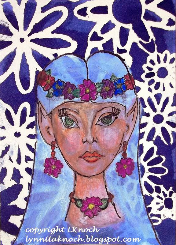
The first card I created was "Elfin Maiden". I used Dylusions Ink Spray through a flower stencil on watercolor paper. After it dried, I blocked in a face with white paint. I used Derwent watercolor pencils to create the face and outlined details with a 0.1 black Sakura Micron Pen. The face was created with inspiration from Jane Davenport's book: Drawing and Painting Beautiful Faces.

Elfin Maiden, 2 1/2" x 3 1/2", watercolor and inks on 140lb watercolor paper 
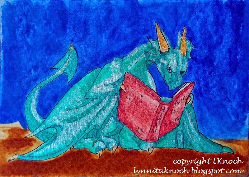
I love dragons and collect dragon figurines. The past year (if you've followed my blog), I worked through the exercises from a book on drawing dragons by J. "Neon Dragon" Peffer. This ATC card, The Reading Dragon, was inspired from one of her books. I painted the background with acrylics. After sketching in the dragon, I painted him with Derwent watercolor pencils and acrylics. I outlined with a 0.2 black Sakura micron pen.

The Reading Dragon, 3 1/2" x 2 1/2", acrylics and watercolor on Bristol paper.
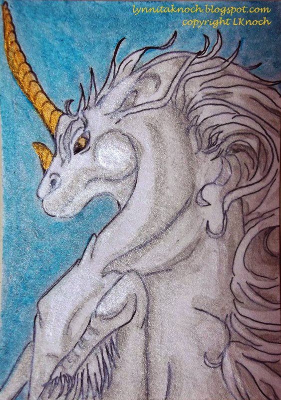
The final card is a prancing unicorn. My daughter told me I needed to make a unicorn, when I had been thinking about Red Riding Hood. The unicorn won out! With help from a book on fantasy creatures by J. "Neon Dragon" Peffer, Dragonart: How to Draw Fantastic Dragons and Fantasy Creatures, I created this proud unicorn.  I sketched in the unicorn and painted him with acrylics and Derwent watercolor pencils. I outlined him with a 0.2 black Sakura micron pen. I used watercolors to fill in the background.

Prancing Unicorn, 2 1/2" x 3 1/2", watercolor and Sakura pen on Bristol paper.
I enjoyed this month's ATC challenge! I hope you join the group next month! You only need to make one ATC card. They are only 2 1/2" x 3 1/2" in size, so it doesn't take a huge commitment to create this size artwork. It's fun, challenging, a great time to experiment. And you might win!!

Whatever you decide, have fun with your artwork and experiment!


Keep creating!
Lynnita


Monday, February 23, 2015

February ATC Challenge - From the Heart

This month's ATC challenge theme is "From the Heart" (see Blue Twig Studio post).  I enjoyed working on the two cards I made for this theme.

Hearts and Feathers - 2 1/2" x 3 1/2" - Silks acrylic glaze,
handmade paper, feathers from my chickens, a giant
rhinestone, and Signo uni-ball white gel pen on Bristol paper.
I first painted the Bristol paper using Love Struck Silks acrylic glaze. Then I added a piece of black handmade paper. It was painted abstractly with metallic reds, golds, pinks and white. Using a white Signo uni-ball gel pen, I added the quote, "A heart without dreams is like a bird without feathers" by author Susy Kassam. Finally, I embellished the card with a brown speckled feather and a white and black feather that my chickens had lost.and a giant rhinestone.


Hearts and Treasure - 2 1/2" by 3 1/2" - Silks acrylic
glaze, 05 black Sakura Microperm pen, hot-fixed
crystals, and a giant rhinestone on Bristol paper.
My second ATC card was also painted with Silks acrylic glazes in Fire Opal and Emperor's Gold colors. Using a 05 black Sakura Microperm pen, I added the Bible verse "Where your treasure is, there your heart will be also." Matthew 6:21. Then I hot-fixed crystals in 3mm AB and 4mm topaz, and 5mm gold squares. Last, I added a giant rhinestone.

I enjoy creating these small works of art. They are quick to do, fun, and a great way to experiment with different techniques and materials. Think about joining us. You only need to make one card!


Keep creating!
Lynnita


Friday, December 5, 2014

Origin Quilt for Mavericks Quilt Guild Challenge

The quilt guild I belong to, The Mavericks, finished up their challenge this month. The theme is "States of Mine", with two quilts - one depicting the Nature of Arizona (where we all currently reside) and the other depicting our Origins or something about the state (city, country, etc) where we grew up. I posted my Arizona quilt last month (see post dated Nov 20).

I was late with my origins quilt, as my Arizona quilt took me much longer than I expected. The show they are currently hung in was delayed, so I had the opportunity to finish it and get it in the show.

I'm originally from Ohio. I had a difficult time deciding what to do for this quilt. I originally wanted to do something with my grandparents farm, as I spent so much time there as a child. I took a photo a of the fall colors of my grandparents shed, where my grandfather always sat outside - no matter the weather. This is the image that always comes to mind, as I always saw Grandpa in that green metal chair in the opening of the shed whenever we pulled in the driveway. However, the challenge stated the quilt had to be 18" wide by 48" high. No matter how I played with the photo, it just didn't work in that format.

The second image I thought about using to make a quilt was one of the pond towards the back of the woods on my grandparent's farm. We played there year round - swimming and fishing in the summer, fishing in the spring and fall, and ice skating in the winter with bonfires and cookouts year-round. The pond and woods were my favorite playground as a child. However, the photo looked much better in a horizontal format, instead of a vertical format. No matter how I cropped it, I just wasn't happy with the composition.

I love looking at the moon, stars and constellations, which are much more difficult to see well in the city. My Dad gave me a love of astronomy by getting us (my siblings and I) up many nights at 2 or 3 am to look at the moon or stars in a telescope built by a great-Uncle. I remember watching Neil Armstrong orbit the moon through the telescope before they made history by landing on the moon. Neil Armstrong was from a town 20 miles from where I grew up. I had it - I'd paint the Milky Way for my Origin's Quilt.

I started with a piece of black batik cotton fabric to paint. I roughly sketched the Milky Way with an iron-out white fabric marker. Using Jacquard's white textile acrylic paint, I started painting in the background for the Milky Way.
Milky Way, 18"x48". I started painting the
background with Jacquard White Textile paint.

I tried several acrylic and watercolor paints on the black batik, but most of them did not show up. I finally had to use Shiva Oil Paintsticks to achieve the desired color I wanted for the starry background of the Milky Way. I no longer use the Shiva paintsticks as much, because of the strong odor. But they do look lovely on black fabric!
I used Shiva Oil Paintsticks to add color for the
background of the Milk Way to the black fabric.
 I continued with the white textile paint and the Shiva paintsticks to paint in the rest of the Milky Way and the background space for the stars.
Painting the Milky Way with Jacquard white
textile paint and Shiva Oil Paintsticks.
I started dotting in stars using the point of a paintbrush.  I used a toothbrush to splatter white paint to create hundreds of stars. Unfortunately, these weren't large enough. My husband found me a wire brush for removing rust on metal and this made lovely size stars when splattering paint on the fabric. With several sizes for stars between the toothbrush and the wire brush, the quilt had lovely depth to the Milky Way Galaxy.
Stars added to the Milky Way galaxy by splattering with a toothbrush and a wire brush.
 I left a black silhouette of a couple of small trees and a person (myself) standing with arms raised looking up at the Milky Way Galaxy. After waiting a couple days, for the oil paint to dry, it was ready to quilt. I found some patterns that created a "windy" effect on Pinterest. I combined a couple to free-motion quilt wind and clouds in my Milky Way quilt.
"Astronomy Lessons with Dad" - 18" x 48". My
Origin Quilt for the Maverick's 2014 quilt challenge. 
Close up to show some of the quilting details. 

I finished the edges using facing and added a sleeve and label on the back. People that saw my quilt asked me where I found such a wonderful panel -  that was high praise!! Others that saw only my photos asked me how I took pictures of the Milky Way. They were surprised to find out it was a quilt that I hand-painted. I'm very pleased!

It feels good to get both quilts completed and have them in the show in Scottsdale, AZ! Now I need to go see it. It hangs until the beginning of March, so I have time. Then it will go to the Arizona Quilt Guild's Annual Spring Show the end of March and to a show in Georgia sometime later in the year.


Keep creating!
Lynnita


Friday, October 31, 2014

Blue Twig Studio Design Team: Review of Products and first Projects

I have been asked to be a member of Deb Prewitt's Design Team for her shop, Blue Twig Studio.  I feel very honored that Deb chose me. I pray I live up to her expectations! I appreciate any and all comments, as your input is valuable to me.

For the month of November, I tested a few products and used them in two projects (a postcard and tealight holders) that will be displayed at Blue Twig Studio.  I started with quick, easy projects, so these could be done for the upcoming holidays - a handmade postcard you could send someone special or tealight holders for gifts or to decorate your home.

The products I'm specifically testing and reviewing this month are:
  1. Tim Holtz's Distress Paint in brushed pewter  and victorian velvet (pink). (photos 1, 2). These are acrylic paints dabbers for multiple surfaces.
  2. Viva Croco Crackling Color in blackberry (purple color) (photo 3) 
  3. a Mini Navaho, 6x6 Stencil by The Crafters Workshop.com, Designs by Jaime (photo 4)
Photo 1.  Tim Holtz's Distress Paint. 
Photo 2.  Sponge dabbers to
apply the acrylic paint.
Photo 3. Viva Croco Crackling Colour


Photo 4. Mini Navaho 6x6 stencil by The Crafter's Workshop, Designs by Jaime
  A couple other products I used to help create the projects were:
  1. Dylusions Ink Spray in bubblegum pink (photo 5)
  2. Martha Stewart Crafts: Fine Glitter Translucent Glass Paint in antique silver (gold color) (photo 5).
Photo 5. Dylusions Ink Spray and Martha Stewart Crafts: Fine Glitter Translucent Glass Paint.


First Project: Postcard
Photo 6. Postcard with pewter paint.
   The postcard is Strathmore 140 lb 4" x 6" acid-free, cold-pressed watercolor paper. I coated the postcard with the brushed pewter distress paint, leaving a shiny gray surface (photo 6). I added the victorian velvet (pink) paint through the stencil (photo 7), but it didn't work very well. The paint bled under the stencil, leaving a fuzzy pattern. I ended up smearing the paint over the entire postcard, so the postcard has a mottled background of pewter and pink.(photo 8). I decided to try the glittery translucent paint that I have in antique silver with the stencil (photo 9.) Some of the stencil pattern isn't well-defined, but I like the texture and color it adds to the matte effect of the distress paints. I like bright colors, so I sprayed Dylusions Ink Spray in bubblegum pink through the stencil over one corner of the postcard. (photo 10). To see how the cracking colour works on paper,  I added it to just a few of the stenciled areas for more interest, texture, and value (photo 11).  After the crackling colour dried for 24 hours, I zentangled the word JOY using black Sakura micron pens in sizes 0.01, 0.03, and 0.05 (photo 12). For further embellishment, I added a large opalescent sequin and a pink fabric flower over it the "O" (photo 13).

Photo 7. Adding pink paint through the stencil.
Photo 8. Mottled background layer of pewter and pink paint.


Photo 10. Sprayed Dylusions Ink Spray through stencil.
Photo 9. Glittery translucent paint stenciled.


Photo 12. "JOY" zentangled with micron pens across postcard

Photo 11. Crackling colour added selectively.
Photo 13. Finished postcard front. 

    The back of the postcard looked naked being bare of any paint or designs. I painted the back of the postcard with the distress paint dabbers, again creating a mottled pewter and victorian velvet (pink) background.   I added these quotes about JOY to the back once the paint was dry.(photo 14).

  • "Choose JOY" - Sara Frankl
  • "JOY, being happy, is a choice that you make every day." - Dawn Camp
  • "I will take Joy in the God of my salvation." - Habakkuk 3:18

I addressed it to myself for Deb to mail to me when she is done with the sample.

Photo 14. Back of postcard showing the "letter" side.


Second Project: Tealight Holders
     I also made tealight holders with the crackling colour. I started with a pair of 2" square glass holders (photo 15). Initially I painted them with the Martha Stewart Translucent Glittery Glass Paint in antique silver, which actually was more gold in color (photo 16). After that dried, I painted them with the blackberry crackling colour (photo 17). It needed to cure for 24 hours (photo 18), although the crackling started to appear after only a couple of hours. The tealight holders would look fine this way, but I decided to embellish them with a ribbon, a couple of leaf-shaped sequins, and a circular gold crystal, which I hot-glued to the tealight holders. They look beautiful with the tealights glowing through the crackling colour (photo 19).

Photo 15: Two-inch glass tealight holders.
Photo 16. Coated with antique silver glittery glass paint.
Photo 18. After curing crackling colour for 24 hours.

Photo 17. Adding the blackberry crackling colour.

Photo 19. Golden glow of tealights through the crackling. Holders embellished with ribbon, sequins and crystal.

These tealight holders will make nice, inexpensive gifts for the upcoming holidays or can be used to decorate your home. I love the soft, golden glow showing the crackling effect.


Notes about the products:
    Tim Holtz's sponge dabbers were easy to use the first time I opened them. The paint rolled smoothly over the surface of a watercolor paper postcard.  However, there were a couple days between using the Tim Holtz's Distress Paint dabbers on the front of the postcard and the back of the postcard. I had no problems with the victorian velvet color, but the brushed pewter dabber would not allow paint to flow onto the dabber sponge. I found the ball for mixing the metallic paint was stuck in the opening where the paint flows. However, even after removing it, I still could not get paint to flow onto the dabber sponge. I ended up using removing the dabber sponge cap and dipping a paint brush into the bottle of paint and knocking it over in the process. Thankfully, I was able to save most of the paint. The bottles do say to store them upside-down, which I did. I would advise if the dabber will not work, to pour a couple drops of paint into a palette and close the bottle.  (Do NOT work with an open bottle of paint! lol!)
    The directions for the crackling colour say to use a thicker layer to get the best crackling effect, with 1-4 mm being the optimum range of thickness.  The crackling on the postcard and the glass tealight holders came out best where I layered the colour closer to 1mm than the 4mm of thickness. The thicker layers on the glass did not crackle as well (as can be seen in photo 19). On the other hand, too thin a layer does not crackle at all  - this happened on one place on the postcard, where I got the layer too thin (photo 13).

Other thoughts:
     I had never used the Viva Croco Crackling Colour before, although I have used Tim Holtz's Distress Paint previously. The victorian velvet and brushing pewter created a challenge, as these are not colors I normally use. But I had fun creating the postcard. I plan to create more postcards to send to family for the upcoming holidays. I love the tealight holders, but  I enjoy lighting candles especially when we have guests. I will be making more sets of these to give to my daughter and daughters-in-law for Christmas.

     I hope you enjoyed the review and projects. Try these products, if you haven't already. Experiment and have fun!


Keep creating!!


Tuesday, September 30, 2014

Sept ATC Challenge - On the Road

I was late getting me ATCs done this month. For some reason, I thought I had another week before the end of the month. So I hope they arrive in time for the challenge. If not, hopefully, they'll be there in time to send to the winner.

This month's theme was "On the Road".  I kept thinking of landscapes or places I've traveled to or wish to travel to or a road leading through a forest ..... on and on and on. Everything that I thought of just made me feel like it really didn't fit the theme of "On the Road"  - that is would fit better with "Vacation" or "Trees" or "Weather".

About that time, I received an email from Pinterest showing me various boards people have created about "On the Road".  How serendipitous is that?  These made me think about when I traveled with my family as a child and what my parents did to keep us from being bored on a road trip. We played different games: i.e. finding the alphabet in order on billboards and license plates, or how many different states were represented in license plate, or how many horses or cows we could count on "my" side of the road. These made me feel more like I was describing the theme "On the Road".

Therefore, I made up three different ATC cards. I started with watercolor paper and painted either the background. Then I found online images of license plates from the 50 states, a road trip scavenger hunt, and a road trip bingo game to add to my card.

50 State License Plates ATC card. Watercolor background on 140 lb watercolor 
paper. Image attached with matte medium. We used to see how many different 
states we could find on license plates when we traveled as children.
Road Trip Bingo ATC card. Watercolor background on watercolor paper. 
Image attached with matte medium. I added little beads for markers for the
game - one on the free spot and two ready to cover any signs spotted "on
the road". This is similar to another we played as children when we traveled. 
Road Trip Scavenger Hunt ATC card. Watercolor background with image 
attached with matte medium. I added images of the items 'found' on the 
scavenger hunt.  We played this game with our children when they were 
young while traveling on road trips. 

I'm not sure I was real creative with my ATC cards this month. It's good to get out my box and try to create something for themes that I wouldn't normally think about doing. Thankfully, they are just small works of art!

It'll be fun to see what everyone created this month. You can see them on Deb Prewitt's blog. Oct's theme is "Wild, Wild West". Should be fun!

Keep creating!


Saturday, August 30, 2014

August ATC Cards - Circus Theme

The theme for August for the ATC cards for Blue Twig Studio's ATC Swap is "the circus." I really don't remember going to a circus as a child, but I do remember taking my own kids to the circus several times when they were young. I think I enjoyed it as much as they did. So I have fond memories of the circus

In spite of this, I found the circus a tough subject for this small piece of art. It took me most of the month to decide what I wanted to do. I did several searches on circus images and quotes involving the circus to help inspire me.

I finally found a saying that I liked:

      "If you surround yourself with clowns, don't be surprised when life resembles a circus."
             - Steve Maraboli

This made me think of a picture of a bunch of clowns. This is the ATC card that resulted from this saying. I found an image of clowns and used that for inspiration for my collection of clown faces for this ATC card. I used watercolor pencils and Sharpie markers to paint the clown faces.

"Life Resembles a Circus" - 2 1/2" x 3 1/2" Derwent watercolor pencils, Sharpie
 Fine-Point Markers on 140lb watercolor paper. Saying by Steve Maraboli.

The other ATC card was inspired by an image called "Circus, Circus" by Marco Bombach. It reminded me of a 3-ring circus! It was full of color. All the shapes were created by simple geometric lines, curves, and shapes. It was very interesting how he created all the various elements. My version is simplified and doesn't connect all the lines, curves, and shapes like he did to create the various elements. I created the elements and then tried to connect the lines to make them look like they were meant to be created by flowing lines and curves. I also didn't use as much shading as Bombach does.

"Circus" - 2 1/2" x 3 1/2" Derwent watercolor pencils, Sharpie Fine-Point Markers
on 140 lb watercolor paper. Inspired by Marco Bombach's "Circus, Circus". 


I finished these late on Aug 29th and got in the mail on the 30th! Aargh!! I forgot about Monday being a holiday - Labor Day! I hope Deb waits to receive cards till Sept 2, instead of the 1st like normal! Oops! Need to get inspired sooner, next month!!!


Keep creating!!


Thursday, July 31, 2014

ATC Cards for July Challenge

Deb Prewitt at Blue Twig Studio has a monthly ATC Challenge. June's ATC challenge was eyes and the ATC's really captured my attention. They are so unique and beautiful. Depending on how many ATC's are returned each month, Deb picks 1-3 winners and the winners receive a portion to all of the ATC's for that month.

I've belonged to a couple of ATC groups here in AZ over the past few years. The first one had about 12 people in the group and we voted on a theme each month. You had to make 13 cards (one for each person and one for the store) and we traded cards. It was fun and creative. The group disbanded when the store we met at closed. Last year, I joined another group for a time that had about 16 members. Making that many cards each month took too much time, with everything else on my schedule, so I ended up dropping out of the group.

With Deb's encouragement, I decided to try join her ATC Challenge. The really nice thing with this group is that I only need to make one card to enter! I think I can handle one card! After all it's only 3 1/2" x 2 1/2" in size! That's just a tiny piece of artwork! 

July's challenge is birds.  I made 2 different ATC cards and mailed them off to her. I mailed them off a week ago, but didn't want to post them before the deadline to have the cards turned in. These are the cards I made.

Before I really knew exactly what I wanted to create for a "bird" ATC card, I started off using yellow, orange, pink, red and a touch of blue watercolor to create a background on mixed-media paper. I added salt before it dried to add some texture.

First try at a watercolor background on mixed-media paper.. 
I decided to create birds silhouetted against the moon on one side of the card, with a saying "Indulge your imagination in every possible flight" on the other side of the card. I tried to add a white moon to the above background, but it doesn't show up. Save it for another month!!!  I got a piece of 140lb watercolor paper and started over. I used blue, indigo, and black to create a background and then lifted the paint to create a half-moon on one side of the watercolor.


Watercolor background with salt texture on
140 lb watercolor paper. 
Finished ATC card. Watercolor background.
Black Prismacolor pen size 0.01 was used to
create the birds, Multicolor brush style
Prismacolor pens were used for the saying.

 
 I had a better idea what I wanted to do for a second ATC card. I started with mixed-media paper and painted half of it in watercolors with blue and greens.  I again added salt to add a bit of texture.The other half the card is covered with black card stock on which I drew a feather design drawn with several colors of Souffle pens. Then I added a 3D sticker of a bird perched on a birdhouse to the blue background. and an envelope with a card in it with a saying, "My favorite weather is bird-chirping weather."

Finished ATC card. 
Finished ATC card showing the saying that
the envelope contains. 


Back of ATC cards.

Both cards have the same thing on the back for a label. I've seen others who use a stamp for the ATC label, but I've never found one to buy, so I just hand-label all of them. 

I hope these are good enough for the group. I've been sick and the month of July got away from me before I realized if I didn't get something made, I would never get it mailed in time for Deb to receive them. 

Keep creating!!