Showing posts with label watercolors. Show all posts

Wednesday, June 24, 2015

May ATC Challenge - Tea Party

I'm running really behind in posting on my blog. Between my computer acting up, my granddaughter getting her first illness (which was scary with the heart defect - she is fine now!), going out of town, and just life in general, time has gotten away from me!

At any rate, May's ATC Challenge, hosted by Blue Twig Studio,  was Tea Party. I made two cards. The first was a collage.
Can You Lend Your Ear? ATC Card, 2 1/2" x 3 1/2". Collage on multimedia paper.

I layered the background with Dylusions Spray Inks through a couple of stencils. Then I added a photo of a tea cup with a fairy peeking around a column under the moonlight that I cut from a fantasy magazine, adding steam to the cup with a micron pen. Finally, I added a piece of Washi tape with a teapot that says, "I'm just very lucky. Can you lend your ear for a while?" 

The second ATC card was from a favorite nursery rhyme:
I'm a Little Teapot. ATC Card, 2 1/2" x 3 1/2", Watercolor pencils on multimedia paper.
I found a free clip art with a picture of this vintage teapot. I drew and painted it using Derwent watercolor pencils.  I'm a Little Teapot was one of my favorite nursery rhymes as a child. I taped two 2 1/2" x 3 1/2" cards together with Washi tape featuring music. I painted the background blue with Derwent watercolor pencils and wrote out the I'm a Little Teapot nursery rhyme. The "I'm a Little Teapot" ATC card opens up like a tiny book, featuring the nursery rhyme inside.

Inside of "I'm a Little Teapot" ATC card.

The ATC Challenge is taking a break for a couple of months. I will let you know when it restarts! 

Keep creating!
Lynnita


Friday, May 8, 2015

Blue Twig Studio - April Product Review and Projects

This month, I received a package of Twinkling H2Os by Luminarte for review for Blue Twig Studio.  I had heard a lot of great comments about these from friends the last few months and had been wanting to try them, but couldn't justify buying yet another type of paint. Therefore, I was very excited when I received these for my April product review!!

Product:
Twinkling H2Os are highly pigmented, light fast, lusciously luminescent mica-infused watercolors. The H2Os are non-toxic and archival safe. The amount of water used determines if the color is opaque, translucent or transparent. This set contained 12 jars of H2Os, along with a free spritz bottle. The colors in my set included: poppy, rose gold, persimmon, mango mamba, mustard green, autumn butternut, black cherry, plum crazy, blue zircon, sweet alfalfa, cedar wood, and pearl red.
     (Note: my spritz bottle arrived with a crack starting at the spritzer and running a third of the way around the spritz head. Needless to say, it didn't work very well as a spritzer, but was still able to use it as clean water. I could spritz, if I didn't mind water spraying )
Twinkling H2Os by Luminarte
Open jars of Twinkling H2Os. Colors listed on cap to right of paint jar.
Color chart for Twinkling H2Os. 
The watercolor comes as a solid hard-pan cake. When you open the desired jars, the colors can be "woke up" by spraying the surface of the paint cakes. Directions state: after allowing the water to soak in for 3-5 minutes, mist the jars a second time and wait a couple more minutes. The paint begins to soften and it easily mixes into a creamy texture when dipping a paintbrush in it. I actually had to wait about 10 minutes and I used a toothpick to mix the paint. The Twinkling H2Os can be used for painting freehand, creating color washes, to color inside the lines of a drawing or rubber stamped image, or to apply to a rubber stamp before stamping with it.


Projects:
Pico Embellisher in 
irRESISTible Neon colors.
For my project, I was initially going to paint an 8"x10" canvas. I painted an abstract background and then planned to use a large 8 1/2" x 11" Crazy Lace stamp by Kari McKnight-Holbrook (see Blue Twig Studio large stamps) with black acrylic paint to create an overall design on the abstract background. Unfortunately, my black paint didn't stay wet enough by the time I got the whole stamp coated and did not print well on my canvas. Therefore, I scrapped this project. I'll try to salvage it for some other project in the future.

In interest of time, I chose to create several tags that can be used as gift tags, bookmarks, labels, luggage tags, and so on. My daughter joined me and made tags, as well. Following are the results. Besides brushes, a palette knife, and a freezer paper palette, I used Derwent watercolor pencils, black Sakura micron pens, and Pico Embellishers to accent the tags.


Lydia Tag, 2 3/4" x 5 1/5", Twinkling H2Os and Pico Embellisher on watercolor paper.
I started with the plum crazy color to create a "sea" background. Then pulled the paint to the 'sky' area with more water to make it lighter. Using mango mamba, I created sun rays peeking through a stormy sky, and added pearl red to the 'sea' to create more depth and waves.  I had planned to stamp dolphins in the 'sea'. However, the sea and sky didn't come out as they appeared in my head.After lifting some of the paint by adding more water, I used blue zircon to paint Lydia and outlined it with the mustard green (which appears more like an antique gold). I highlighted Lydia with a pink neon Pico Embellisher and edged the tag with pearl red. A couple hearts with a neon green Pico Embellisher in the corners, along with blue and multicolored yarn for hanging completed the tag. I am pleased with the results, as I thought this tag was a lost cause! (Painted by my daughter.)
Peacock Feather Tag, 2 3/4" x 5 1/5", Twinkling H2Os on watercolor paper. 
Still wanting to make a sea with dolphins, I used the blue zircon for my 'sea' and painted the bottom half of the tag. I added sweet alfalfa for depth and waves.  Now to create a sunset. I decided to practice the sunset on a different card (see dolphin card below). Since my sunset came out so nice, I just used that card instead of this one. Now what do I do with this card?  The paint was dry, however, I found by adding water to the card, I was able to pull the blue zircon paint up to the top of the card, creating a blueish background with sweet alfalfa highlights. The color made me think of a peacock feather, since the blue zircon appears more teal than blue. Using shades of mango mamba, rose gold, persimmon, sweet alfalfa, and plum crazy, I stenciled a peacock feather onto the background. A small brush helped get into the narrow openings in this stencil without any bleeding under the stencil. (Painted by my daughter.)
Dolphin Tag, 2 3/4" x 5 1/5". Twinkling H2Os on watercolor paper. Using mango mamba, rose gold, and black cherry, I freehand painted a sunset.  I used freezer paper as a palette for mixing the paints for the sunset. I was pleasantly surprised when I found I could reactive the paint on the freezer paper up to 30 minutes after it had dried. I did not test how long the paint could sit and still be reactivated. I added the blue zircon for the sea, with highlights of sweet alfalfa. Painting plum crazy on a dolphin stamp, I was able to stamp two dolphins leaping out of the sea. This is my daughter's favorite tag. (Painted by my daughter.) 
Music Tag, 2 3/4" x 5 1/5", Twinkling H2Os and black Sakura micron pen on watercolor paper.  
I created an abstract background by brushing swirls of colors onto the tag. I used plum crazy, blue zircon, sweet alfalfa, and persimmon paints.Some of the paints I left opaque and others I thinned with water for more transparency (can't see this well in photo).  I sprinkled salt on the wet paint. However, once dry, the salt didn't come off easily, so some was left in place. The salt created some texture in the plum crazy and persimmon colors, but not as much as I had hoped for.  I used a 0.02 black Sakura micron pen to draw in music staffs and notes, as well as a saying by Oliver Wendell Holmes, "Most of us go to the grave with our music still inside us.". I found this in the book Creative is a Verb by Patti Digh, which I am reading for book club for April, May and June (see my review for chapters 1-3 here). This saying really struck a chord with me, so I had to put it on a tag. (Painted by Lynnita.)
Blooming Tag, 2 3/4" x 5 1/5", Twinkling H2Os and Pico Embellisher on watercolor paper. 
I wanted to see how well the Twinkling H2Os did with a stencil, so I painted persimmon, rose gold, black cherry and mango mamba through a pod stencil.  Unlike the peacock feather where I used a small brush to apply paint, I used a stencil brush this time. In the smallest pod at the bottom, the mango mamba mixed with rose gold paint was too thin and bled under the stencil. I used a blue Pico Embellisher to add the saying, "Life is an empty square unless one fills it up with matter!" by Robin Antar. This was another saying in the book, Creative is a Verb. (Painted by Lynnita.)
Pondering Tag, 2 3/4" x 5 1/5", Twinkling H2Os, Sakura micron pen, and Derwent watercolor pencils on watercolor paper. I freehand painted the face first with pearl red, using blue zircon for the eyes and poppy for the lips. Her hair is cedar wood with autumn butternut highlights, while her top is rose gold with salt for texture. Using a flexible rubber stamp, I painted sweet alfalfa and blue zircon to create a background. The sweet alfalfa worked fairly well, but the blue zircon just bled everywhere. Once it was dry, I stamped over the blue zircon area with another stamp using the sweet alfalfa paint. I used Derwent watercolor pencils to add shading to the face and a 0.005 black Sakura micron pen to add the details. (Painted by Lynnita.)
Luggage Tag, 2 3/4" x 5 1/5", Twinkling H2Os on fabric. Using pieces of Tim Holtz's Electric Elements fabrics leftover from the Nov 2014 Fabric club kit reviewed  Dec 1, 2014,I cut small pieces of the fabric and enhanced the print with the Twinkling H2O paints in several of the colors. Once the paint dried, I heat set it.  I stitched a collage of the fabric for the front of the luggage tag. I finished the edge with a piece of fuzzy, multicolor, eyelash yarn. The hand of the fabric stayed soft for the luggage tag front. (Painted by Lynnita.)
Luggage Tag back. I scribbled with several colors of the Twinkling H2Os on the back of the luggage tag just to test the hand of the fabric. I used a substantial amount of the mango mamba in the center, but smaller amounts of several other colors. Once it was dry, I heat set the paint. Where I used the larger amount of the mango mamba, the fabric was stiff, but in the other areas, the fabric still has a soft hand. The twinkling H2Os work well on fabric, but use a small amount to keep a soft hand. I didn't realize I was out of the clear vinyl to create a pocket on the back of the luggage tag for the address. So this will be added later. (Painted by Lynnita.)

Product Review:
I thoroughly enjoyed working with the paints - they are bright, luminescent and easy to use. I was able to reactivate the paints that dried on the freezer paper palette even after 30 minutes. This was awesome to find out! This ability to reactivate allowed my daughter to fix mistakes in a couple of her tags that she thought were lost causes. This also allows mixing the paints to create new colors, knowing that I won't waste paint from it drying out too fast.

The paints work well with both stencils and stamps, although you want to use stamps that are deeply etched, have thick, wide lines, bold graphics, and/or large surface areas. Avoid stamps with shallow tiny detail lines. These do not work very well. When using stencils, be sure the paints are not extremely wet, so they do not bleed under the stencil. Also a small brush can be used to paint in small stencil openings.

I have one negative comment. It was stated that the paint needs to be dry before closing the jars. Even in the 'dry' Arizona heat, the paints were still wet after 2 1/2 hours. I closed them, anyway, as I was ready to sleep by 1:00 am. When I checked them the next day, all the paints were still wet, paint had gotten on the lids making it difficult to open a couple of them, and two of them had actually leaked. So I left them open again.It still took another 2-3 hours before they were fully dry and I could close them. This will create a challenge for me to use them, as I do not have a dedicated work space at the moment and cannot leave opened jars of paint out where grandchildren could get a hold of them.


I hope you enjoyed this review and will consider using these wonderful, sparkling watercolors! They are worth buying, even if you have many other paints!

Keep creating!
Lynnita

Monday, April 13, 2015

March ATC Challenge - Fairy Tales

It's been a couple hectic weeks. I'm running behind in posting again! Someday, I'm going to figure out how to help my daughter and son-in-law with their special needs daughter, taking her to several doctor's appointments, babysitting my other grandchildren, posting photos of all the grandchildren for our Ohio family on facebook, continue creating artwork and quilts, while finding time to post on my blog!! I'm not sure how young mothers do it all!!  I was doing fine until our special granddaughter was born prematurely. Since then, I've been struggling to post at all, let alone in a timely manner! Lol!!

Today, my goal is to get a few posts completed that I should have posted in the last couple of weeks. First is Blue Twig Studio's ATC Challenge for March, which was Fairy Tales.  I have loved fairy tales since I was a child. Two of my favorite books as a child were Grimm's Fairy Tales and a book of tall tales and fables that my parents gave me for Christmas when I was 8 years old. I still treasure those books. I've been a science fiction and fantasy reader ever since!

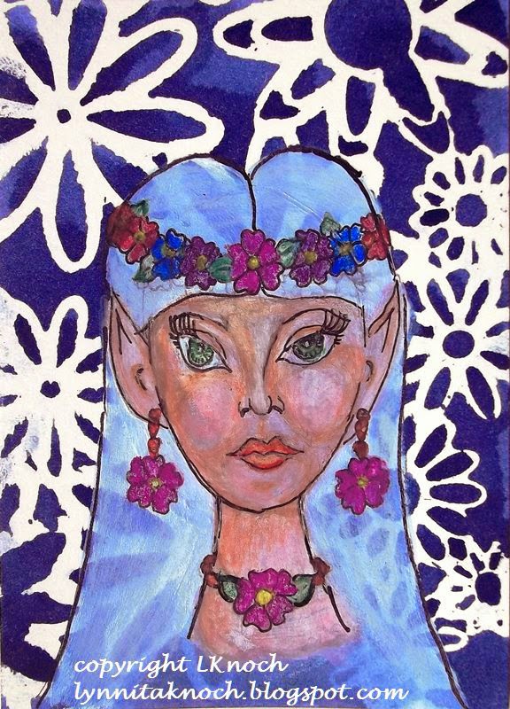
The first card I created was "Elfin Maiden". I used Dylusions Ink Spray through a flower stencil on watercolor paper. After it dried, I blocked in a face with white paint. I used Derwent watercolor pencils to create the face and outlined details with a 0.1 black Sakura Micron Pen. The face was created with inspiration from Jane Davenport's book: Drawing and Painting Beautiful Faces.

Elfin Maiden, 2 1/2" x 3 1/2", watercolor and inks on 140lb watercolor paper 
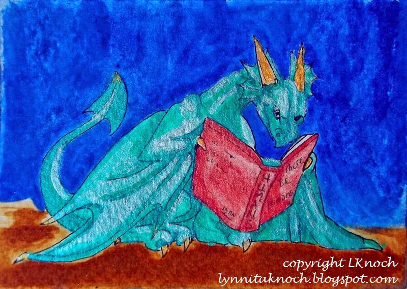
I love dragons and collect dragon figurines. The past year (if you've followed my blog), I worked through the exercises from a book on drawing dragons by J. "Neon Dragon" Peffer. This ATC card, The Reading Dragon, was inspired from one of her books. I painted the background with acrylics. After sketching in the dragon, I painted him with Derwent watercolor pencils and acrylics. I outlined with a 0.2 black Sakura micron pen.

The Reading Dragon, 3 1/2" x 2 1/2", acrylics and watercolor on Bristol paper.
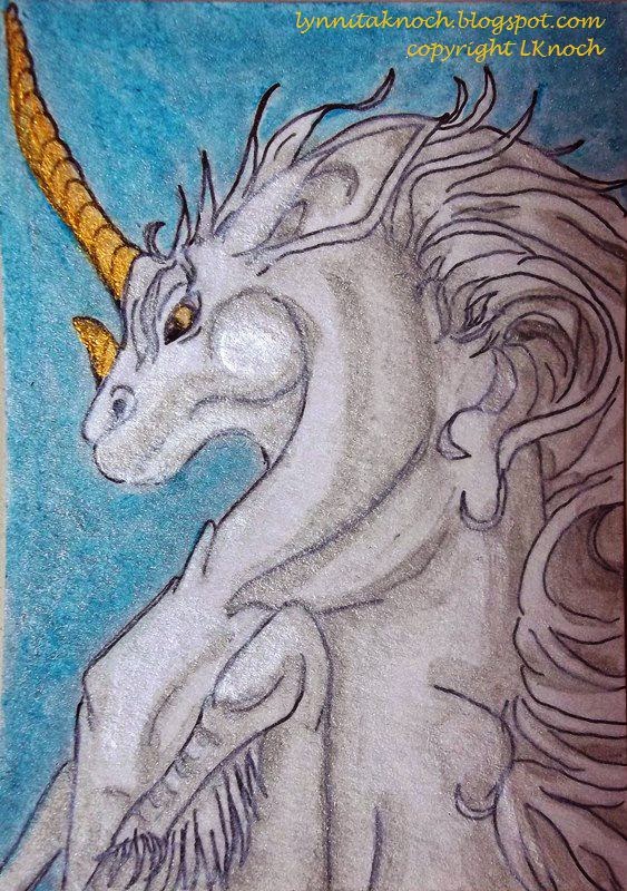
The final card is a prancing unicorn. My daughter told me I needed to make a unicorn, when I had been thinking about Red Riding Hood. The unicorn won out! With help from a book on fantasy creatures by J. "Neon Dragon" Peffer, Dragonart: How to Draw Fantastic Dragons and Fantasy Creatures, I created this proud unicorn.  I sketched in the unicorn and painted him with acrylics and Derwent watercolor pencils. I outlined him with a 0.2 black Sakura micron pen. I used watercolors to fill in the background.

Prancing Unicorn, 2 1/2" x 3 1/2", watercolor and Sakura pen on Bristol paper.
I enjoyed this month's ATC challenge! I hope you join the group next month! You only need to make one ATC card. They are only 2 1/2" x 3 1/2" in size, so it doesn't take a huge commitment to create this size artwork. It's fun, challenging, a great time to experiment. And you might win!!

Whatever you decide, have fun with your artwork and experiment!


Keep creating!
Lynnita


Thursday, March 12, 2015

Blue Twig Studio - Feb Product Review

I'm running a bit late with February's product review for Blue Twig Studio as my granddaughter was born a month premature and spent 3 weeks in the neonatal ICU, I had hand surgery on my dominant hand to remove a ganglion cyst, and then I needed IV fluids for severe dehydration due the worst case of flu I have ever had. It was a long month. Our granddaughter is now home from the hospital and doing well. She will require open heart surgery when she is 4-6 months old to repair a congenital heart defect. I am feeling much better and my hand has healed for the most part - at least I can use it again!

I finally finished my review and project for five different black pens and a sketchbook.

The pens include:

Various black pens on mixed-media paper.
  •  a black Sakura 02 micron pen (0.30mm nib) - an archival writing and design pen; acid-free; fine-line for papercrafts, journals, illustration, manga art and crafts; comes in 6 nib sizes and 15 colors.
  • a black Faber Castell Pitt artist pen (0.60mm nib) - black India ink; waterproof; permanent; acid-free; archival; for sketching, journals, cartooning, fine-ink drawings; perfect for mixed-media; ideal for traveling. 
  • a black Sakura 05 Microperm pen (0.45mm nib) - permanent on most surfaces; water and fade resistant; alcohol based cleaners may remove ink; do not launder; test prior to final application; low odor. 
  • a black Uni-ball Signo 207 Impact gel pen (1.0mm nib) - contoured rubber grip; uni-super InkTM to help prevent against check and document fraud; thick, vibrant lines to make a bold statement; refillable, quick-drying, fade- and water-resistant gel pen. 
  • a black fine point Sharpie pen.(1.00mm nib) - a permanent marker that marks on most surfaces; is quick-drying, fade-and water-resistant; no bleed and smear resistant.
Bleed-thru of pens on mixed-media paper.
The photo above shows the five pens written on mixed-media paper with a tangle pattern that used a heavy black fill. All the pens wrote well. The Sakura micron and the Faber-Castell Pitt artist pen both have a nice, fine black mark. This is nice for writing, illustrating and fine lines for Zentangles or ZIAs (Zentangle-Inspired Art). The Sakura Microperm pen is actually darker than the Uni-ball Signo Impact gel pen, although it has a smaller nib size. The Sharpie fine-point pen having the boldest, blackest line of all the pens. It has the same nib size as the Uni-ball Signo Impact 207 gel pen.

The Sakura Microperm pen and the Sharpie
fine-point pen both show significant bleed-thru on mixed-media paper.  The tangle patterns for both the Faber Castell Pitt artist pen and Uni-ball Signo Impact 207 gel pen can be seen in the photo on the reverse side of the paper, but the actual paper does not show bleed-thru.


Crescent RENDЯ 
3.5" x 5.5" sketchbook.   
The sketchbook:
I reviewed a Crescent RENDЯ 3.5" x 5.5" sketchbook. It has acid- and lignin-free, white heavy-weight, 110 lb paper consisting of 32 sheets or 64 pages, with a regular binding. The sketchbook claims media won't bleed though pages, that the pages will lay flat, and it can be used with all media, including spray paint, markers, pastels, pencil (or charcoal), watercolors, and ink. Note: Limited show-through may occur over time with heavy application of Xylene markers. This sketchbook is made in the USA.

I first created several pages in black and white, using the five pens included in the review. I am happy to report that not one of the black pens show any sign of bleed-thru. I was able to work on both sides of the pages for my art journaling. After creating the artwork with the various pens, I went back and added color using various media to test the claims of the sketchbook. None of the media I used bled-thru the pages, although some of the watercolors, spray paints, and pastels managed to run over the edges of the sheets onto other sheets, as I was very enthusiastic in my application of the various media. Following is the artwork I created in the sketchbook to date.

Title page using Sakura micron pen.
Title page after adding watercolors. I also added gel 
pens in various colors over the letters in "Journal". 
The page curled initially after getting wet from the 
watercolors, but eventually dried flat.

Quote using the Faber-Castell Pitt artist pen. Zingers and feather done with Sakura micron pen.
Added Tim Holtz Distress Stain in spiced marmalade through a TCW Mini
Daisy Cluster 6" stencil. Added red ink with a Sakura Moonlight gel pen. 
Zentangle Garden using Sakura micron, Faber-Castell Pitt artist, and
Sakura Microperm pens and shaded with charcoal.
Derwent watercolor pencils were used to add color to the Zentangle Garden.
Zentangle stripes using Sakura micron, Sakura Micropern, and Uni-ball Signo Impact pens.
Prismacolor Nupastel color blocks used to add a rainbow of color between
 the Zentangle stripes. Sealed with Krylon Workable Fixatif 1306.
Dragon and quote created with Sharpie fine-point and Sakura Microperm pens.
Tim Holtz Distress Stain in aged mahogany applied to TCW Mini Navaho 6" stencil over the quote. Background, horns, beak, and eyes of dragon painted with Derwent watercolor pencils. Dragon wings and scales painted with blackberry Facetten-Lack Croco Crackling Colour. Unfortunately, only a few spots on the body were thick enough to show the crackling effect. The rest was painted too thin for the paint to crackle.  
Griffin Momma and babies. Momma griffin created with Uni-ball
Signo Impact gel pen and babies created with Sakura micron pen.
Griffins painted with Prismacolor Premiere markers and Tombow markers. 
Tombow marker blender used to help blend the various shades of markers. 
Background painted with Derwent watercolor pencils.
Sisters created with Faber-Castell Pitt artist pen.
Background spray-painted in layers with Dylusions Ink Spray in London blue, lemon zest, and pure sunshine, and Perfect Pearls Mists in perfect copper.  TCW Mini Swirly Garden and TCW Mini Wedding Ring stencils were used.  The faces were painted with titanium white acrylic paint and various shades of Derwent watercolor pencils. The hair was created from a clothing catalog and adhered using matte medium.


I enjoyed all the products this month. A variety of black pens is essential for artwork, as drawings, Zentangles, illustrations, quotes, mixed-media, and so forth, all require a mixture of line widths and a shades of black. The Crescent RENDЯ sketchbook was a joy to work with using a variety of media. I felt it met the claims it made - I had no bleed-thru using any of the black pens or the various media I added to my artwork. The pages laid flat, so I could easily work across two pages.  Note:  I did not use gesso on any of these pages prior to creating any of the above drawings, as I did not want it to add any strength to the paper in order to test the claims made by the company.

The only comment I have would be to watch the amount of water (or alcohol) added to the page, as too much can make the pages start to roughen. Although, I scrubbed a few spots and still had no bleed-thru and could still paint these spots. Also, the more liquid added to the pages, the more they curl. However, the pages became almost flat once dry. If they need to be completely flat, the sketchbook can be pressed between two heavy items to finish flattening any curled pages.

I would definitely use a Crescent RENDЯ sketchbook for any art journal needs. The 3.5" x 5.5" size is perfect for traveling. It fits in my purse nicely, along with the pens, to enable me to create anywhere. A larger size would be nice for working out of at home.

Keep creating!
Lynnita


Thursday, January 29, 2015

January ATC Challenge - Circles

The theme for this month's ATC Challenge from Blue Twig Studio is circles.  I made two cards for this month.

The first one is Zentangle-Inspired-Art or ZIA. I drew 5 circles with a pencil and then started adding various tangles with a 0.005 black Sakura micron pen. I used a 0.05 black Sakura micron pen in the areas filled with black ink. I added shading with a pencil and tortillion. I used fain, flower, dragonair, tipples, and mooka tangle patterns. Zentangles are so very relaxing and fun to create. I never know how the finished piece will turn out until I'm done. It's always a happy surprise. I added this quote to the back:
                 "It's okay to spin around and around in the same place. Just so long as your  
                 singing your heart out. THAT's what life is all about." - Chica Umino

Zen Circles ATC - 2 1/2" x 3 1/2". 0.005 and 0.05 black
Sakura micron pen and pencil on bristol paper.

The second ATC card started with blue watercolor painted in streaks on the bristol paper. Then I added circles of colors in yellow, blue, red, white, green, and purples. With a white paint pen, I added dots and dashes inside a couple of the circles. I embellished three of the circles with flower sequins and a fan-shaped sequin. I added googly eyes and a crystal nose to two of the circles to add whimsy to the whole card. On the back, I added this quote:
               "When in doubt, run in circles, scream and shout." - Laurence J. Peter

Googly Eye Circles ATC - 2 1/2" x 3 1/2" - watercolor on bristol paper.
 Embellished with sequins, googly eyes, and crystals.

This was a fun challenge. I hope you will join us next time!

Keep creating!!
Lynnita

Thursday, July 31, 2014

ATC Cards for July Challenge

Deb Prewitt at Blue Twig Studio has a monthly ATC Challenge. June's ATC challenge was eyes and the ATC's really captured my attention. They are so unique and beautiful. Depending on how many ATC's are returned each month, Deb picks 1-3 winners and the winners receive a portion to all of the ATC's for that month.

I've belonged to a couple of ATC groups here in AZ over the past few years. The first one had about 12 people in the group and we voted on a theme each month. You had to make 13 cards (one for each person and one for the store) and we traded cards. It was fun and creative. The group disbanded when the store we met at closed. Last year, I joined another group for a time that had about 16 members. Making that many cards each month took too much time, with everything else on my schedule, so I ended up dropping out of the group.

With Deb's encouragement, I decided to try join her ATC Challenge. The really nice thing with this group is that I only need to make one card to enter! I think I can handle one card! After all it's only 3 1/2" x 2 1/2" in size! That's just a tiny piece of artwork! 

July's challenge is birds.  I made 2 different ATC cards and mailed them off to her. I mailed them off a week ago, but didn't want to post them before the deadline to have the cards turned in. These are the cards I made.

Before I really knew exactly what I wanted to create for a "bird" ATC card, I started off using yellow, orange, pink, red and a touch of blue watercolor to create a background on mixed-media paper. I added salt before it dried to add some texture.

First try at a watercolor background on mixed-media paper.. 
I decided to create birds silhouetted against the moon on one side of the card, with a saying "Indulge your imagination in every possible flight" on the other side of the card. I tried to add a white moon to the above background, but it doesn't show up. Save it for another month!!!  I got a piece of 140lb watercolor paper and started over. I used blue, indigo, and black to create a background and then lifted the paint to create a half-moon on one side of the watercolor.


Watercolor background with salt texture on
140 lb watercolor paper. 
Finished ATC card. Watercolor background.
Black Prismacolor pen size 0.01 was used to
create the birds, Multicolor brush style
Prismacolor pens were used for the saying.

 
 I had a better idea what I wanted to do for a second ATC card. I started with mixed-media paper and painted half of it in watercolors with blue and greens.  I again added salt to add a bit of texture.The other half the card is covered with black card stock on which I drew a feather design drawn with several colors of Souffle pens. Then I added a 3D sticker of a bird perched on a birdhouse to the blue background. and an envelope with a card in it with a saying, "My favorite weather is bird-chirping weather."

Finished ATC card. 
Finished ATC card showing the saying that
the envelope contains. 


Back of ATC cards.

Both cards have the same thing on the back for a label. I've seen others who use a stamp for the ATC label, but I've never found one to buy, so I just hand-label all of them. 

I hope these are good enough for the group. I've been sick and the month of July got away from me before I realized if I didn't get something made, I would never get it mailed in time for Deb to receive them. 

Keep creating!!


Tuesday, June 10, 2014

Week 23 of 365 Days of Art Challenge

Can you believe it's June already?!! The year is almost half over! I feel like I'm accomplishing some great creativity this year - this 365 Days of Art Challenge has been a significant part of it! It has really kept me inspired to sketch or quilt, dye fabric, make digital artwork, take photographs with an eye for art (not just family), or do some kind of creative project every week. It has also inspired me to blog at least once weekly, if not more often. The important thing is I'm being creative on a regular basis! Thank you, Deb, for the push!!
DragonArt Evolution: how to
Draw Everything Dragon by
J. "Neon Dragon" Peffer

This week I have gotten back to the book by J "Neon Dragon" Peffer, DragonArt Evolution: How to Draw Everything Dragon.  It's been several weeks since I've sketched the exercises in this book (see previous posts starting in Week 3, with the last one in Week 14).  So far, I've worked on eyes, the jaw, ears, horns, and wings. This week, the exercise worked on dragon scales.

Following are the seven dragon scales patterns introduced in the book. These sketches are not of any particular part of the dragon's body - just a shape in which to practice scales.

Scale Pattern 1: a series of half ovals for scales. Pencil on mix-media paper.
Scale Pattern 2: scales created with polygons to look bumpy. Pencil on mixed-media paper.
Scale Pattern 3: flat scales. Pencil on mixed-media paper.
Scale Pattern 4: v-shaped scales of varying colors. Pencil on mixed-media paper.
Scale Pattern 5: Rectangular, bumpy, glossy scales with a duller,
leathery hide beneath. Pencil on mixed-media paper.
Scale Pattern 6: glossy scales of the underbelly. Pencil on mixed-media paper.
Scale Pattern 7: v-shaped scale plating of the underbelly. These scales are larger
and overlap more then flatter interlocking scales. Pencil on mixed-media paper.

I have to post a couple photos of a dragon painting I did a several years ago. Everyone teased me because my dragon had rectangular scales, telling me that dragons do NOT have rectangular scales, but they DO have forked tongues and bloodshot eyes.   Then today, when I was sketching, I had to laugh, as Scale Pattern 5 is rectangular scales!!  My art teacher, Leonard Baer, a retired illustrator and artist, told me to go with what I felt was right. He was encouraging, had a wicked sense of humor, and inspired me to try different mediums - oil, colored pencil, dye inks, pastel, etc - and that I could do any subject - portraits, landscapes, animals, still lifes, fantasy, whatever I wanted to try. He will always be with an encouragement to me.

He of the Forked Tongue, 16" x 20", dye inks on photographic paper, private collection.
Dragon with rectangular scales. One of the first dragons I ever painted when
I first started taking art lessons with Leonard Baer, a retired illustrator and artist.
Closeup of dragon so the rectangular scales can be better seen. 
 
It was fun to get back to this type of sketching. I'd been doing Zentangle-inspired art for several weeks and digital artwork for the last couple of weeks. Those have been fun and creative, but actually sketching with a pencil (or graphite or charcoal) and shading to create dimension is a much different process. It's a more intense process for me and I love the challenge of creating a 3-dimensional image on a 2-dimensional paper. 

I hope you've had a creative week!