Showing posts with label acrylics. Show all posts

Monday, May 4, 2015

Week 17 - Weekly Art Challenge - Painted Canvases

This week for my weekly art challenge I started a couple of canvases. I had planned to use them for April's Design Team project for Blue Twig Studio. Once they were dry, I just wasn't sure what direction to head, so decided to do something else for the review (see upcoming post, dated May 7, 2015).

For the first canvas, I drizzled several acrylic colors onto the blank canvas. Then I took a piece of plastic wrap and placed over the canvas. After smooshing (very complicated artistic technique!) the paint over the canvas, I allowed the paint to dry with the plastic wrap still laying on the canvas. This is the result after peeling the plastic wrap off the dried, painted canvas.

Textured Abstract, 8"x10" board canvas, metallic acrylics in blue, peacock, lime green, yellow, pink, wine, and purple.
I love the texture the plastic wrap creates. Surprisingly, mud isn't usually created when mixing the paints in this serendipitous manner. I plan to add more layering to this canvas to create a mixed-media painting. I'm just not sure what direction I want to take, yet.

When I peeled the plastic wrap off the above canvas, I noticed that the paint in the wrinkles of the plastic wrap was still wet. So I took a 2nd canvas and laid the plastic wrap on top of it, smoothing the wrinkles out. Again, once the paint was dry, I peeled off the plastic wrap, resulting in this canvas.

Ink Blot, 8"x10" watercolor canvas. Wet paint left on plastic warp.
This left a lot of white still on the canvas (although it looks pink in the photo), but the texture and abstractness of the paint is unique! It's almost like an ink blot. What do you see? I found a horse grazing in a field and also a dragon soaring in the sky, looking down at some interesting speck on the ground. This reminds me of looking at clouds to see what shapes they make and creating stories about them. I'm not sure what I will create with this - the horse, the dragon, or something else entirely - but I think it's a great way to start a painting.


Keep creating!
Lynnita


Sunday, May 3, 2015

April ATC Challenge - Architecture

This month's ATC challenge for Blue Twig Studio was architecture. This was a tough challenge for me. I really struggled with what to do for architecture. Finally, I had to just do it, as the deadline (April 30!) was quickly approaching.

I feel like I chose a couple of easy ideas, but I like how they turned out! For the first one, I created a simple landscape with a 3D house made of cardboard, so it looked as if it had siding and a slate blue stone roof. I tried to create a welcoming house with blue shutters and a warm, yellow glow showing through the windows and front door. The house has a walkway surrounded by stones and flowers. A tree is on one side of the house, and a bush on the other. The sun is shining, while birds soar in the sky.
House, 2 1/2" x 3 1/2", acrylics, gel pens, Souffle
pens, and Sharpie on watercolor paper. Front view.


House. Side view to show 3D effects. 


The 2nd ATC card is designed in a Zentangle-Inspired Art fashion, using ancient Greek architecture enhancements for the tangles. Swirls, feathers, fancy leaves, and geometric shapes were used to embellish the many columns, pillars, archways, porticoes, and other entry ways in ancient Greece.

Ancient Greek Architecture, 2 1/2" x 3 1/2", Bristol
paper, 0.005 and 0.02 black Sakura pens.


May's ATC theme is "Tea Party". Only one card is needed to join! ATC's are only 2 1/2" x 3 1/2", so they are small pieces of artwork. They can be simple or as complex as desired. Lots of fun, they are a good canvas for experimenting with that new technique you wanted to try. They can be done with paper or fabric or a combination of materials. Embellishments can be up stand or dangle off the card.  A winner is drawn at random to win all the cards! (Unless more than 20 cards are turned in, then a 2nd winner will be drawn). See Deb Prewitt's blog for more details and where to send your card.


Keep creating!
Lynnita


Tuesday, April 14, 2015

Blue Twig Studio - March Product Review and Projects

Deco-Art Media - black gesso, transparent crackle
glaze, white crackle paste, and white modeling paste
I had fun with the products from Blue Twig Studio for March. As a design team member, I review various products and create a project(s) with them.  The products I'm reviewing this month are:

  • Andy Skinner mixed media stencils - 
    • 6"x6" "Have Your Say" alphabet stencil 
    • Andy Skinner Stencils - 6'x6" alphabet and 12"x3" tread
    • 12" x 3" Tread Carefully 
  •  Deco Art Media
    • Black Gesso
    • Transparent Crackle Glaze
    • White Crackle Paste
    • White Modeling Paste
  • My own products added to create projects
    • Matte medium
    • Acrylic paint
    • Dylusions Ink Sprays:
    • Paper ephemera (magazines, music)
    • Tim Holtz Distress Paints
    • Luninarte Silks Acrylic Glazes
    • Palette knife
    • Stencil brush

Projects:  I created two pieces of art using these products. I started both on 8" x 10" canvas boards.

Collage Project:  

 I layered various pictures from magazines, music, and words in a
pleasing arrangement and glued them down using matte medium. 
 
 Next, I spritzed the board with yellows, pinks and purple Dylusion Ink sprays.
I spread the white modeling paste through the tread stencil 
with a palette knife to various areas of the collage.
I painted the dried white modeling paste with blue, maroon, and gold Luminarte Silk Acrylic Glazes.  I chose the Silk glazes, as they have a sparkle to them when dry. I added a light purple acrylic paint to the white crackle paste and spread that with the palette knife through the alphabet stencil.
Finally, after the paint and crackle paste had dried, I added the transparent crackle glaze over the eye, flowers in the vase, and cheetah heads. Unfortunately, in the photo, the crackle effect from both the purple crackle paste and the transparent crackle glaze do not show up. However, the transparent crackle glaze adds a wonderful sparkle to the collage.


Stenciled ZIA Project:
Initially, I covered the canvas board with the black gesso and let it dry. Next I spritzed copper, gold, blue, and lime green Dylusion Ink sprays using papers to mark off broad lines to spray.
Next, I painted various metallic acrylic paints and a few Tim Holtz distress stains in blue, copper, pink and purple through the Tread Carefully stencil with a stencil brush diagonally across the stripes. I painted a 2nd Tread Carefully diagonal in light blue, fern green, and pinks in the opposite direction.  
Next, I spread the white modeling paste with a palette knife through various 6" x 6" stencils that reminded me of Zentangle tangle patterns. Note: the lime green Dylusions ink bled through the white modeling paste even though it had cured for 24 hours.
Finally, I painted the modeling paste with white acrylic paint where the lime green Dylusion ink had bled through.  Unfortunately, in the photo, the Dylusion ink stripes do not show up very well through the modeling paste like they actually appear. I decided this project was complete, as it reminded me of a Zentangle, but done with stencils, paint, and modeling paste!

Product Review:  
       I enjoyed working with this month's products. The stencils are fun and will be used frequently. I can see the Tread Carefully, not only as a tread, but as animal skin, dragon skin, stones, landscape, and so on. The Alphabet stencil will come in handy for many mixed-media projects.
       Black gesso will be wonderful for making colors pop or to just do something different than using white gesso for a base. 
       The modeling paste spreads very easily with a palette knife through the stencils - even in small openings. It dries semi-transparent, as I could read some of the letters and music after it had dried in the collage project. However, I did find that the lime green Dylusions ink bled completely through the modeling paste in the ZIA project. A bit of the yellow Dylusion ink bled through the modeling paste in the collage paste, but not as dramatically as the lime green bled. None of the other Dylusions ink colors bled at all.
       The white crackle paste worked wonderfully. It mixed easily with paint, so color can be added to the paste. It spread easily with the palette knife through the stencil. Although, once I added paint, it bled a bit under some of the thinner lines in the stencil. I was able to remove the paste with a small paintbrush or toothpick where it had bled under the stencil in many cases.
       The transparent crackle glaze adds a nice sparkle. It is self-leveling, so it does not work under stencils. I tried it with the Tread Carefully stencil and it spread terribly, so I scraped it off with the palette knife before it dried. Therefore, only use the transparent crackle glaze on open areas. Also, I used a toothpick to pop any bubbles. One comment: it was hard to see if I had the areas I wanted covered coated evenly. I wasn't able to tell until it had dried. I did not try to add another layer in thinner areas. 


Thank you for joining me this month. The projects can be seen at Blue Twig Studio in Colorado Springs, Colorado. I hope you will consider trying some of these products. 

Keep creating.
Lynnita


Monday, April 13, 2015

March ATC Challenge - Fairy Tales

It's been a couple hectic weeks. I'm running behind in posting again! Someday, I'm going to figure out how to help my daughter and son-in-law with their special needs daughter, taking her to several doctor's appointments, babysitting my other grandchildren, posting photos of all the grandchildren for our Ohio family on facebook, continue creating artwork and quilts, while finding time to post on my blog!! I'm not sure how young mothers do it all!!  I was doing fine until our special granddaughter was born prematurely. Since then, I've been struggling to post at all, let alone in a timely manner! Lol!!

Today, my goal is to get a few posts completed that I should have posted in the last couple of weeks. First is Blue Twig Studio's ATC Challenge for March, which was Fairy Tales.  I have loved fairy tales since I was a child. Two of my favorite books as a child were Grimm's Fairy Tales and a book of tall tales and fables that my parents gave me for Christmas when I was 8 years old. I still treasure those books. I've been a science fiction and fantasy reader ever since!

The first card I created was "Elfin Maiden". I used Dylusions Ink Spray through a flower stencil on watercolor paper. After it dried, I blocked in a face with white paint. I used Derwent watercolor pencils to create the face and outlined details with a 0.1 black Sakura Micron Pen. The face was created with inspiration from Jane Davenport's book: Drawing and Painting Beautiful Faces.
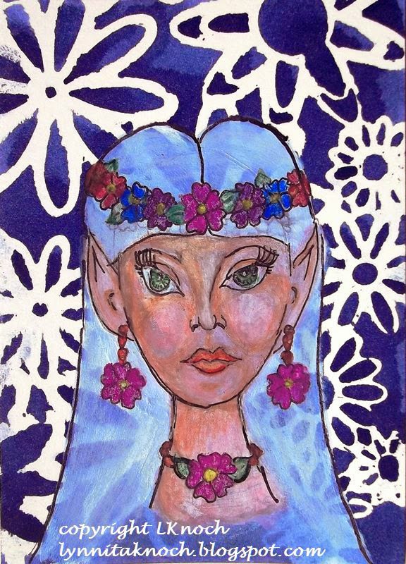
Elfin Maiden, 2 1/2" x 3 1/2", watercolor and inks on 140lb watercolor paper 
I love dragons and collect dragon figurines. The past year (if you've followed my blog), I worked through the exercises from a book on drawing dragons by J. "Neon Dragon" Peffer. This ATC card, The Reading Dragon, was inspired from one of her books. I painted the background with acrylics. After sketching in the dragon, I painted him with Derwent watercolor pencils and acrylics. I outlined with a 0.2 black Sakura micron pen.
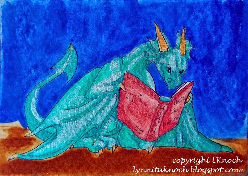
The Reading Dragon, 3 1/2" x 2 1/2", acrylics and watercolor on Bristol paper.
The final card is a prancing unicorn. My daughter told me I needed to make a unicorn, when I had been thinking about Red Riding Hood. The unicorn won out! With help from a book on fantasy creatures by J. "Neon Dragon" Peffer, Dragonart: How to Draw Fantastic Dragons and Fantasy Creatures, I created this proud unicorn.  I sketched in the unicorn and painted him with acrylics and Derwent watercolor pencils. I outlined him with a 0.2 black Sakura micron pen. I used watercolors to fill in the background.
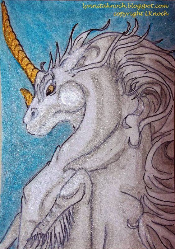
Prancing Unicorn, 2 1/2" x 3 1/2", watercolor and Sakura pen on Bristol paper.
I enjoyed this month's ATC challenge! I hope you join the group next month! You only need to make one ATC card. They are only 2 1/2" x 3 1/2" in size, so it doesn't take a huge commitment to create this size artwork. It's fun, challenging, a great time to experiment. And you might win!!

Whatever you decide, have fun with your artwork and experiment!


Keep creating!
Lynnita


Monday, February 23, 2015

February ATC Challenge - From the Heart

This month's ATC challenge theme is "From the Heart" (see Blue Twig Studio post).  I enjoyed working on the two cards I made for this theme.

Hearts and Feathers - 2 1/2" x 3 1/2" - Silks acrylic glaze,
handmade paper, feathers from my chickens, a giant
rhinestone, and Signo uni-ball white gel pen on Bristol paper.
I first painted the Bristol paper using Love Struck Silks acrylic glaze. Then I added a piece of black handmade paper. It was painted abstractly with metallic reds, golds, pinks and white. Using a white Signo uni-ball gel pen, I added the quote, "A heart without dreams is like a bird without feathers" by author Susy Kassam. Finally, I embellished the card with a brown speckled feather and a white and black feather that my chickens had lost.and a giant rhinestone.


Hearts and Treasure - 2 1/2" by 3 1/2" - Silks acrylic
glaze, 05 black Sakura Microperm pen, hot-fixed
crystals, and a giant rhinestone on Bristol paper.
My second ATC card was also painted with Silks acrylic glazes in Fire Opal and Emperor's Gold colors. Using a 05 black Sakura Microperm pen, I added the Bible verse "Where your treasure is, there your heart will be also." Matthew 6:21. Then I hot-fixed crystals in 3mm AB and 4mm topaz, and 5mm gold squares. Last, I added a giant rhinestone.

I enjoy creating these small works of art. They are quick to do, fun, and a great way to experiment with different techniques and materials. Think about joining us. You only need to make one card!


Keep creating!
Lynnita