Wednesday, April 9, 2014

Week 14 of 365 Days of Art Challenge

Wasn't sure I was going to get any sketching done this week. I almost always procrastinate about doing our taxes, especially since we usually end up owing money. Therefore, I've been busy working on taxes, adding up all those darn receipts that seem to multiply since I started working on them! Would be so much easier if my husband wasn't a small business owner! But he enjoys being a handyman, working for himself, so I really can't complain!

Back to sketching. I found some time this week, while waiting in doctor's offices (and when I needed a break from receipts!). I wanted to work on some portraits this week, but those take more time than I had available. I fell back to doing more exercises from the dragon book - Dragon Evolution by J. "Neon Dragon" Peffer. This week I sketched different types of dragon wings.

Batlike Dragon Wing in pencil on mixed-media paper. The added flap at the top of the wing
for additional support was difficult to make look correct. I'm not sure I was very successful. 

Fingerless Dragon Wing in pencil on mixed-media paper.. Not sure how this wing is supported
without the elongated fingers, as in the bat-like wing. I like the way it looks, however.

Part-Feathered, Part-Batlike Dragon Wing in pencil on mixed-media paper.
I want to draw a dragon with this type of wing. This was fun to sketch.

Multi-spined Dragon Wing in pencil on mixed-media paper. I like the small added
wing flap by the body. Although, I'm not sure how this helps with flight. 

Tattered Dragon Wing. This wing type is my favorite. I think it's more dramatic.
But, how does a dragon maintain flight with tattered wings?
I enjoyed drawing the various wing types this week. Except for Oriental dragons, most have wings. I'm learning much about the anatomy of a dragon from this book.  Ms. Peffer's book is very well done, making the exercises easy to follow.

On to week 15!! Taxes will be filed by then and I can relax and really enjoy sketching!


Wednesday, April 2, 2014

Week 13 of 365 Days of Art Challenge

Week 13!! I've completed weekly sketches for 1/4 of the year so far! Didn't really believe I could do this. I'm enjoying it, though, and I'm learning to make time for sketching instead of just trying to figure out how to fit some time in for it.

I really wanted to do one of the exercises from Cate Caulacos Prato's Mixed-Media Self-Portraits: Inspiration and Techniques. (See book club discussions from Deb Prewitt at Blue Twig Studio and from previous my blogs from March 31 and March 1.)  In this exercise, you put a transparency on the mirror and trace the features of your face. It was much more difficult than I expected. The outline of my face looked okay, but everything else was warped! Lol! She did say it may take a few tries to get a good outline! I'll post this when I get something that looks like a face!

So, I've continued with my dragon sketches from J. "Neon Dragon" Peffer's book Dragon Evolution. (See info in past posts here.)  I finished the different types of dragon horns that I started in Week 11 of the 365 Days of Art Challenge.

Segmented Horn - pencil on mixed-media paper. I actually
posted  this one in Week 11, but thought I'd re-post it with the
other segmented horn and dragon so they are all in one spot.
Spiked, Segmented Horn.- pencil on mixed-media paper.
Dragon with spiked, segmented horn. - pencil on mixed-media paper. This dragon makes me think
of a water dragon or that he is flying rapidly through the air chasing something.

Ram Horn - pencil on mixed-media paper.
Forward-Facing Ram Horn - pencil on mixed-media paper. It's hard
to tell from this small sketch, that the horn is actually facing forward. 
Dragon with a ram horn - pencil on mixed-media paper. I'm pleased with the expression
on her face, but would soften the edges where the horn attaches if I drew it again.
I also need to center things better, so I'm not running off the edge of my paper! Lol!


Monday, March 31, 2014

Book Club - Mixed-Media Self-Portraits continued

Mixed-Media Self-Portraits: Inspiration & Techniques
by Cate Caulacos Prato
The book club started by Deb Prewitt of Blue Twig Studio continued reading the next chapter of Cate Caulacos Prato's Mixed-Media Self-Portraits: Inspiration and Techniques this month. (See review of the first chapter at Blue Twig Studio's blog here and my blog here.)

The second chapter has focused on "Knowing Thyself: taking the first step toward a self-portrait."  It started with a couple of exercises to understand yourself better - i.e. What color are you? Who lives here? Answering questions about your what you have surrounded yourself with in your home. And lastly, who would you like to be? Children have no problem drawing themselves as who they imagine they are - a princess, a pirate, etc. Who do you imagine yourself to be?

She follows this up with self-portrait exercises - studying yourself in a mirror and getting to know your face.  I like the quote by Leonardo Da Vinci

"The mirror, above all - the mirror is our teacher." 

I love the directions given for drawing the eye. I think the eye is the hardest part of the face to capture. I've done many portraits in colored pencil and oils over the years and it's always the eye that is the hardest part of the face. Without that, the person just doesn't look right. Her directions are great for how to capture the eye!

She also discussed digital portraits, caricatures, gettting started and putting it all together. Several artists shared their thoughts and journey to create self-portraits. Not all portrait examples contained faces. I think that relieves some of the pressure to draw a face that actually looks like you. Portraiture is difficult for most people, and I think that's why doing a self-portrait can be very scary. This chapter helps with easing some of those fears, while giving many helpful ideas to know yourself better and suggestions for creating a self-portrait.

The last several days, I played with a few different photo-editing software to create several digital self-portraits. I used Adobe Photoshop Elements, Pixlr Express, Paper Camera, and FotoRus. They all have slightly different features. I had lots of fun playing. I created a photo collage of some of the self-portraits I had the most fun creating and/or liked the best.

Digital Self-Portrait collage created in FotoRus with InstaMag.
Clockwise, starting in the lower right-hand corner: I used Adobe Photoshop Elements (PE) to crop a photo and enhance the color to create "Just Me, Myself, and I". I further edited this in PE, changing the coloration to create "Bold". I thought the purple skin and green clothing made for a bright, bold portrait. Again in PE, I changed the colors to make a monochromatic blue portrait, then rippled it and used the gradient to create "Fading Away".  In "Unadorned", I took the original self-portrait in PE and turned it into a black and white portrait with warm highlights.  "Sketch" was created in Paper Camera.  In "The All-Seeing Eye", Pixlr Express created 3 slightly different facial views, each a different color, which I imported into Paper Camera for the neon colors. Finally, I used FotoRus with Pip (picture in a picture) to center the eyes of the portrait in a drop of water. "Electric! (or eclectic?)" was created in Pixlr Express using special effects and overlays.  Finally, the blue portrait created in PE was imported into FotoRus Pip to make "Auntie Em, Auntie Em". The bubble reminded of the Wizard of Oz, when Dorothy is calling for Auntie Em in the crystal ball while locked in the room by the Wicked Witch of the West.  

I created a few other digital self-portraits besides the ones shown here. I had so much fun playing with the different effects to see how I could manipulate the portrait. Another great thing about working digitally is I could delete anything I didn't like!! Lol! Working digitally also gave me ideas I would like to try on paper, in paint, or with fabric. 

This chapter has been inspiring to me to create self-portraits and not feel so self-conscious about it. I want to experiment and play now!


Sunday, March 30, 2014

Cactus Flowers and the Sunset

Hedgehog Cactus taken at sunset taken over the weekend. 
My husband and I were walking our dogs this weekend. The neighbor's hedgehog cactus has just started to bloom. The bright pink flowers against the olive cactus and sharp spines with the sunset highlighting the petals -  wish I was a better photographer or had a better camera! Thank goodness for photo-editing software!

Close up of hedgehog cactus bloom. 
Close up of another hedgehog cactus bloom. 

The clouds created a beautiful sunset that same evening. 

Looking to the east.. The mauve against the deep blue makes me want to dye fabrics in these colors. 
Sunset over the weekend. I love the bright yellows and oranges against the lavenders and blues.  
Sunset over the weekend. 

I enjoy taking photos of sunsets and sunrises - well, sunrises when I can pull myself out of bed that early! I love the way the colors mix and blend. I also enjoy taking photos of flowers, especially close-ups. They are so full of color and come in so many shapes and sizes. Studying the colors of nature helps me to pick colors for quilts and artwork.


Thursday, March 27, 2014

Rippling and Warping Photos

I decided to play with Adobe Photoshop Elements this week. I've been struggling to learn how to use this program (a guide book would sure be helpful!). It's a great program, but I don't find it extremely user friendly. I'm determined to learn how to use the program in my lifetime (it will probably take me that long, too, especially since they update the program and change some of the filters and how to get to them periodically!).

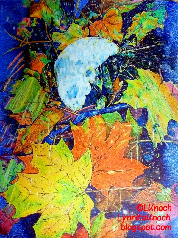
The two main things I played with this week are "ripple", which creates ripples of various frequencies and width in the photo, and "warped", which lays a grid over the photo and allows you to move the grid points around creating a warped grid. I played with four different photos this week. One is a flower photo I took at the Phoenix Zoo, another is a drawing I created (Week 7 of 365 Days of Art Challenge) from a photo of autumn leaves I took in Ohio last year, a third is a sunset last fall, and the fourth is from a photo of a pot of vegetables I cooked to create a chicken pot pie.

Bird of Paradise taken at the Phoenix Zoo. 
Bird of Paradise after it has been rippled and warped in Photoshop Elements.

Autumn Leaves pen,  ink, and colored pencil sketch I did for
Week 7 of the 365 Days of Art Challenge.
Autumn Leaves sketch rippled and warped with a
gradient added in Photoshop Elements.
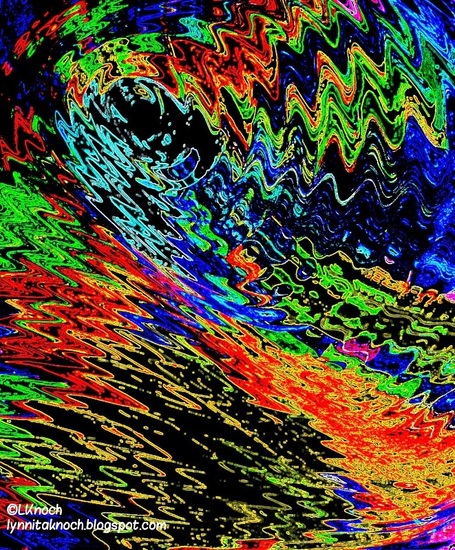
Autumn Leaves further modified in Paper Camera (another photo
editing application)  using the Neon Cola filter.  I think this
would make an interesting piece of fabric to use in quilting.

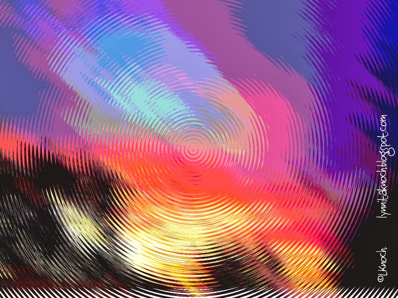
Sunset taken in November in Chandler, AZ.
Sunset after it's been rippled and posterized in Photoshop Elements.
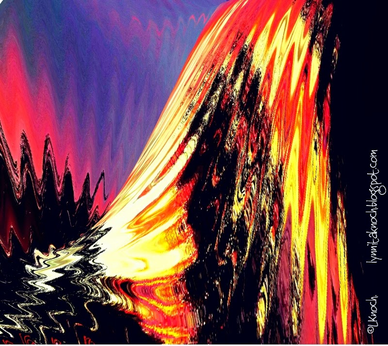
Sunset further modified by warping it. I think this would make a
fun piece of fabric for quilting. 

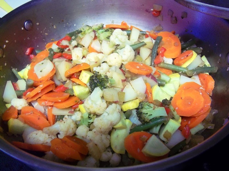
Pot of vegetables cooking to use in a chicken pot pie.
Pot of vegetables first rippled and warped and then adjusted the
color levels to add more red in Photoshop Elements. 
Pot of vegetables further modified by adjusting the
color "curve" values in Photoshop Elements. Another photo that
would make an interesting piece of fabric for quilting.
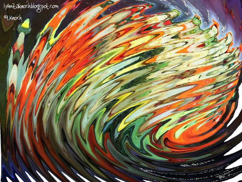
Pot of vegetables further modified by adjusting the color "curve" values
even more to create a softer color palette. Then a circular gradient was added to create the
 center oval of color.  Hard to believe this started out as a pot of vegetables!

I had fun playing with these photos in Photoshop Elements. I would like to have a much better understanding of layers, how to cut items out of a photo to paste in other photos, etc. I have done these manipulations a couple of times, but only able after watching a tutorial on them. I really struggled with cutting an item out of a photo. Will just keep playing! Thank goodness photos are cheap these days and I don't have to develop them to see the results!


Wednesday, March 26, 2014

Week 12 of 365 Days of Art Challenge

Week 12 of the 365 Days of Art Challenge issued by Deb Prewitt of Blue Twig Studio. Another week done! The year is almost 1/4 over already. Time just flies when you're having so much fun!! I am enjoying sketching every week. It's nice to make the time for it, instead of just hoping I can find the time. This is definitely a side benefit of this challenge - learning to make time to sketch! Sometimes I sketch during the day, other times it's at night when I can't sleep. These were at the latter time this week.

I played with Zentangles (or Zentangle-Inspired-Art (ZIA), since they are not on 3 1/2" square tiles) again this week. I started with creating a string of a several circles of various sizes - a couple concentric circles and many overlapping circles. Then I tangled around the circumference of the strings or in the overlapping areas, rather than filling every open spot. It was challenging to find tangles that can be used for a border, rather than a fill. I had fun creating Wheels within Wheels.

Wheels within Wheels - 6"x6" ZIA on mixed-media paper using 0.005, 0.01, 0.05 micron black Sakura pens and pencil. I apologize for the photograph looking yellow - no matter how I changed the lighting
for the photo or the flash on the camera, it came out yellowed looking. This is the best photo I could get.


After creating Wheels within Wheels, I wondered what other geometric shapes- squares, triangles, hearts - might turn out well for a similar ZIA. I chose squares and overlapped squares of various sizes. I created angles in the corners to fill, rather than following the contour of the perimeter, like I did with the circles. This is the result.

Squares within Squares. 6"x6" ZIA on mixed-media paper using 0.005, 0.01, and 0.05 micron
 black Sakura pens and pencils. Thankfully, this photo came out better, without looking so yellow, although
some of my pencil shading doesn't show up very well. Again, changing the lights and/or flash didn't help.

That is all I had time to complete for this week's challenge. I think heart shapes would be fun to do in this style, but not sure if I'll try the triangles. Hexagons are very popular in quilting right now, so maybe they would create an interesting ZIA in a similar design, too. I'll see what I'm inspired to sketch for Week 13! 


Wednesday, March 19, 2014

Week 11 of 365 Days of Art Challenge

Another week of sketching. I did better this week - getting my sketches done mostly over the weekend and taking photographs on Monday, instead of late Tues or Wed morning (my usual). Feels good to be done a bit ahead of time this week!

I took a break this week from the Zentangles and went back to the DragonArt Evolution book by J. "Neon Dragon" Peffer (see past posts for more info about the book). . The next section is different types of dragon horns. So this is what I've worked on this week:

Bladed Horn -  Pencil on mixed-media paper.  This dragon appears benevolent and quiet.

Tri-Horn and Snout Horn types. Pencil on mixed-media paper.

Dragon with both tri- and snout horns. Pencil on mixed-media paper.
I think this dragon appears fierce, but wise. 

Segmented Horn. Pencil on mixed-media paper. I also started a spiked,
segmented horn, but didn't have time to finish it. Therefore, I didn't
get a dragon head sketched for these types of horn either.

I love stories about dragons, especially ones where they help mankind. I want my dragons to be helpful to mankind, but still have emotions and personalities. I hope that as I learn to draw dragons myself, rather than copying what others have done, that I can endow them with feelings and their own quirks. I also like some of the ones that are very whimsical. I hope to draw/paint some with more whimsy, especially baby and young dragons. That feels like a tall order for me right now, but that is my goal.  I hope you don't get tired of looking at dragon sketches this year, as I try to do keep up with weekly sketches for the 365 Days of Art Challenge.